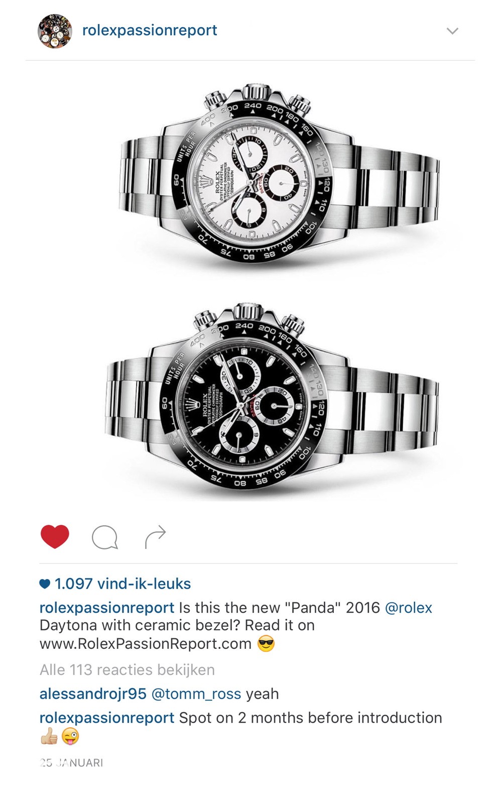
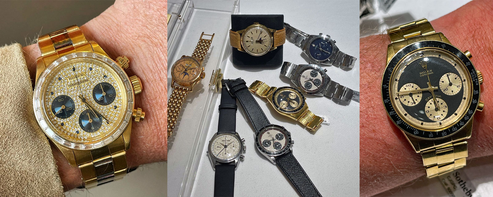
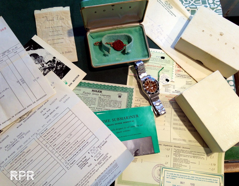
Spot on where my predictions of the 2016 Rolex Basel news! Finally the steel Daytona’s are official. My original post on Instagram of 25 January, some 2 months prior the Basel news, I already show you the new Daytona’s. HQ in Geneva must have been surprised to see that news leaked. FYI, i’m not working for Rolex nor did I break the embargo, it’s purely done by instinct.
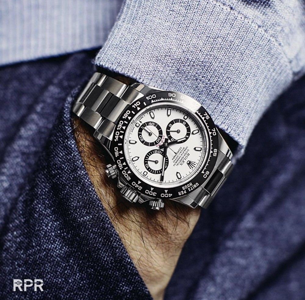
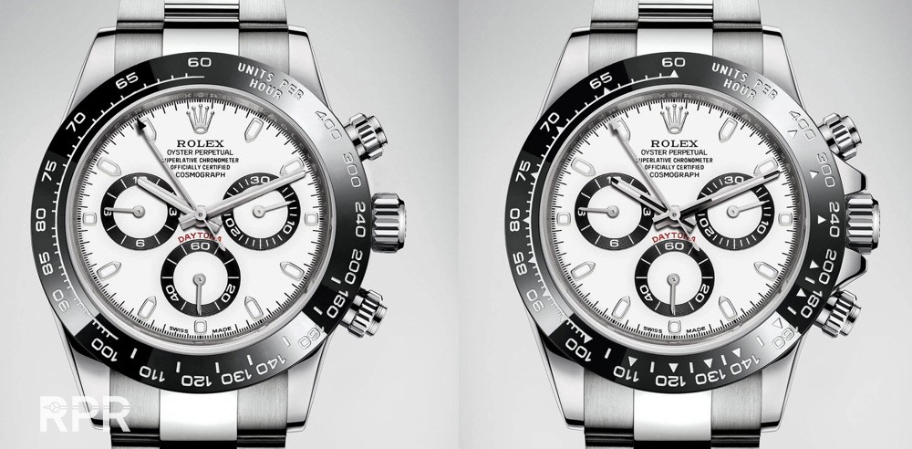
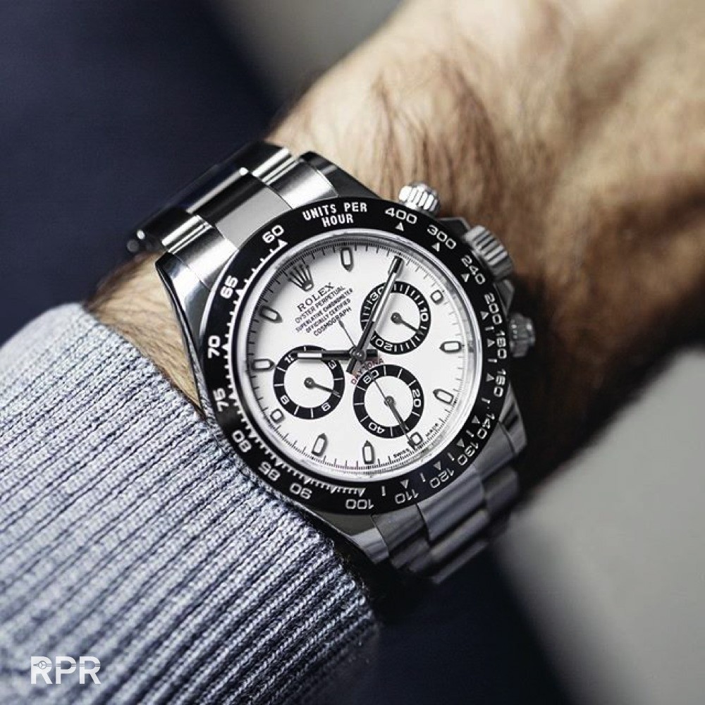
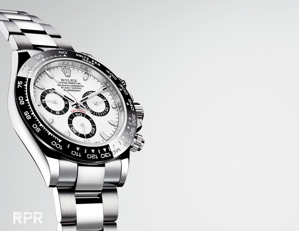
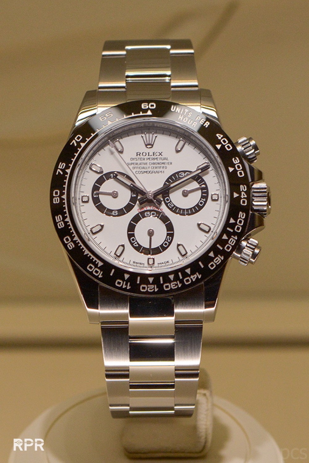
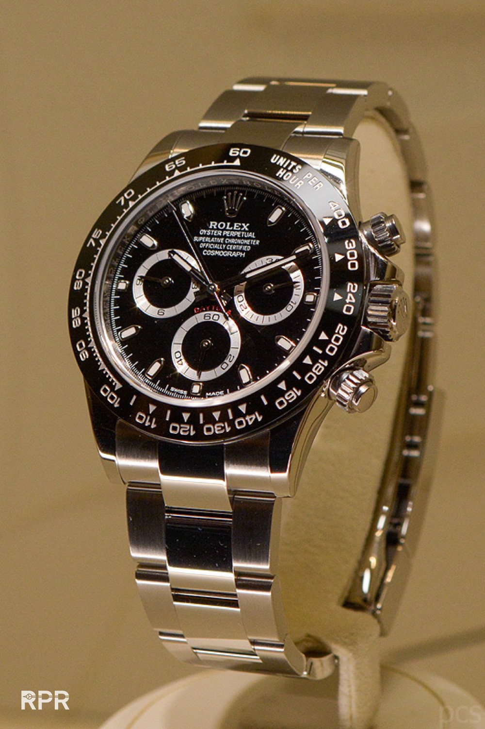
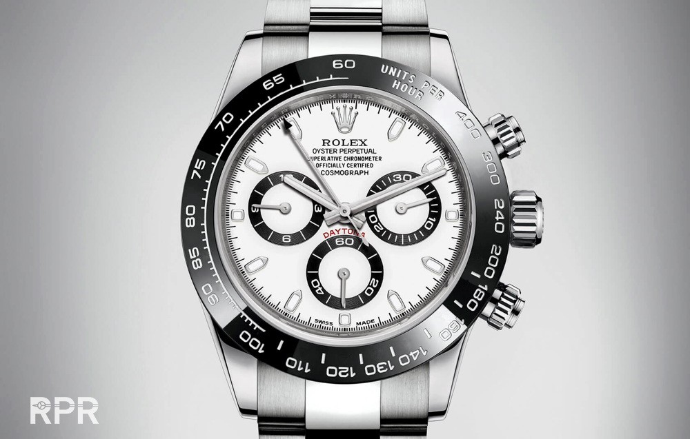
And here is the new stainless steel Rolex Daytona Ref 1165oo LN, like predicted some 3 moths ago over here on RPR 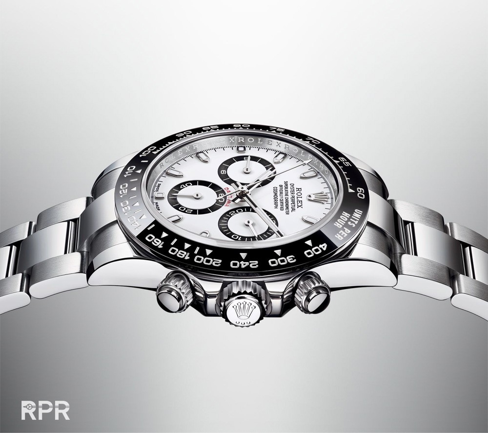
White with black sub dials and black with silver sub-dials. This new Daytona is gonna boost every vintage one 😉
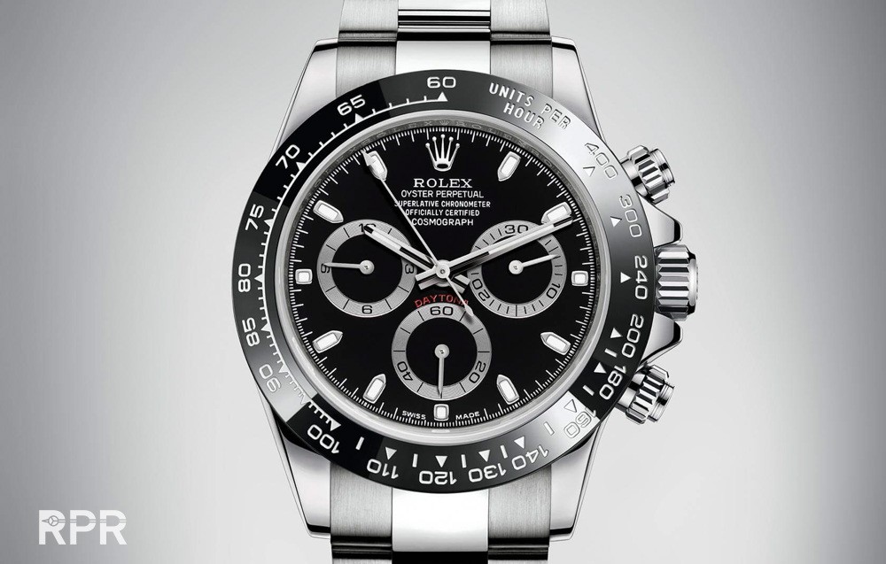
It was not a big surprise that Geneva will be offering us a new updated Rolex Daytona with ceramic bezel. This time it’s up for the steel version. Something I predicted already some months ago and reported about over here… . The Daytona is an iconic and extremely important model for Rolex and the new 2016 model looks perfect to me! 😉
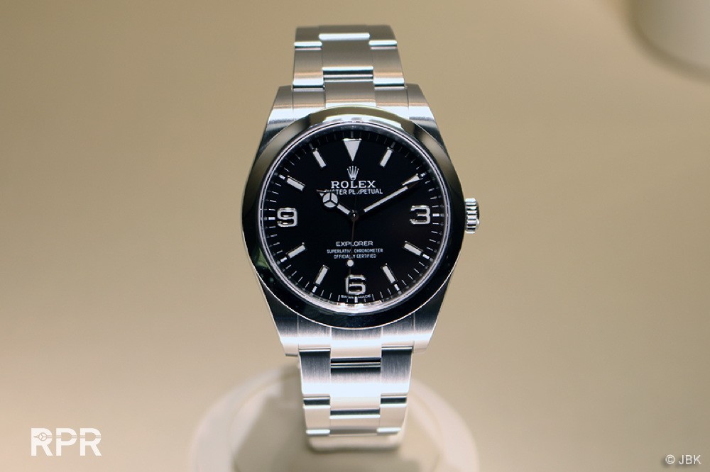
Finally, after 4 years it’s been introduced in 39mm, the Explorer 1 is getting some decent hands, halleluja! 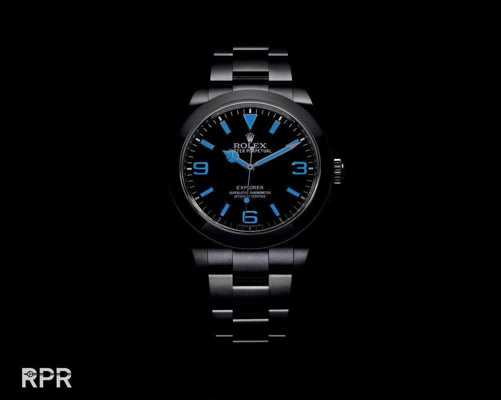
One of Rolex most iconic models is in harmony again, thanks you Rolex! Now I can buy one for my son 😉
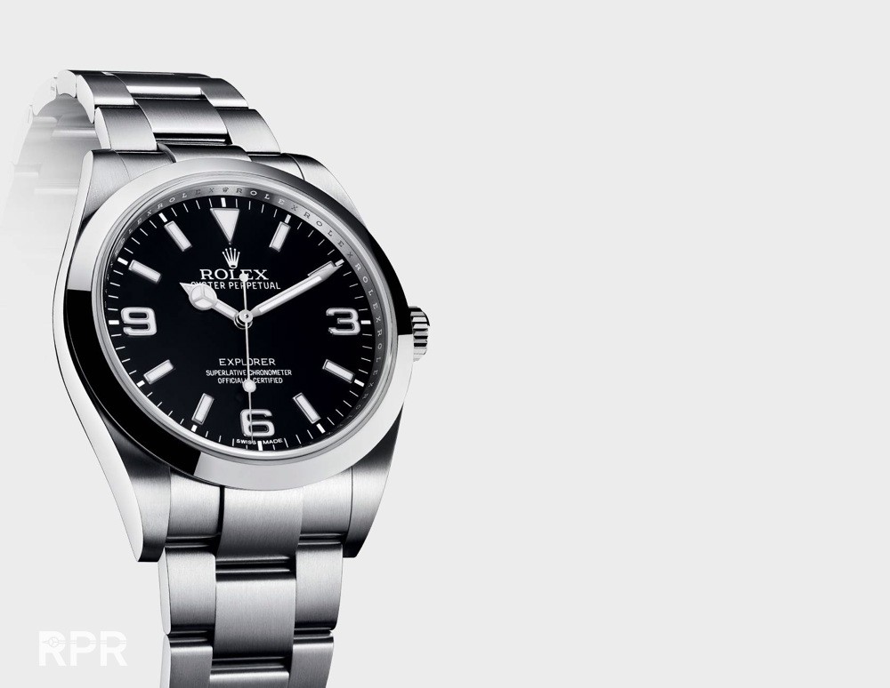
Left one is the old Explorer vs right the new one, which finally got a matching handset!

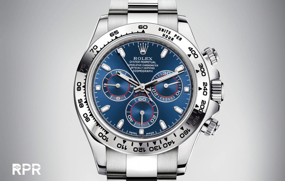
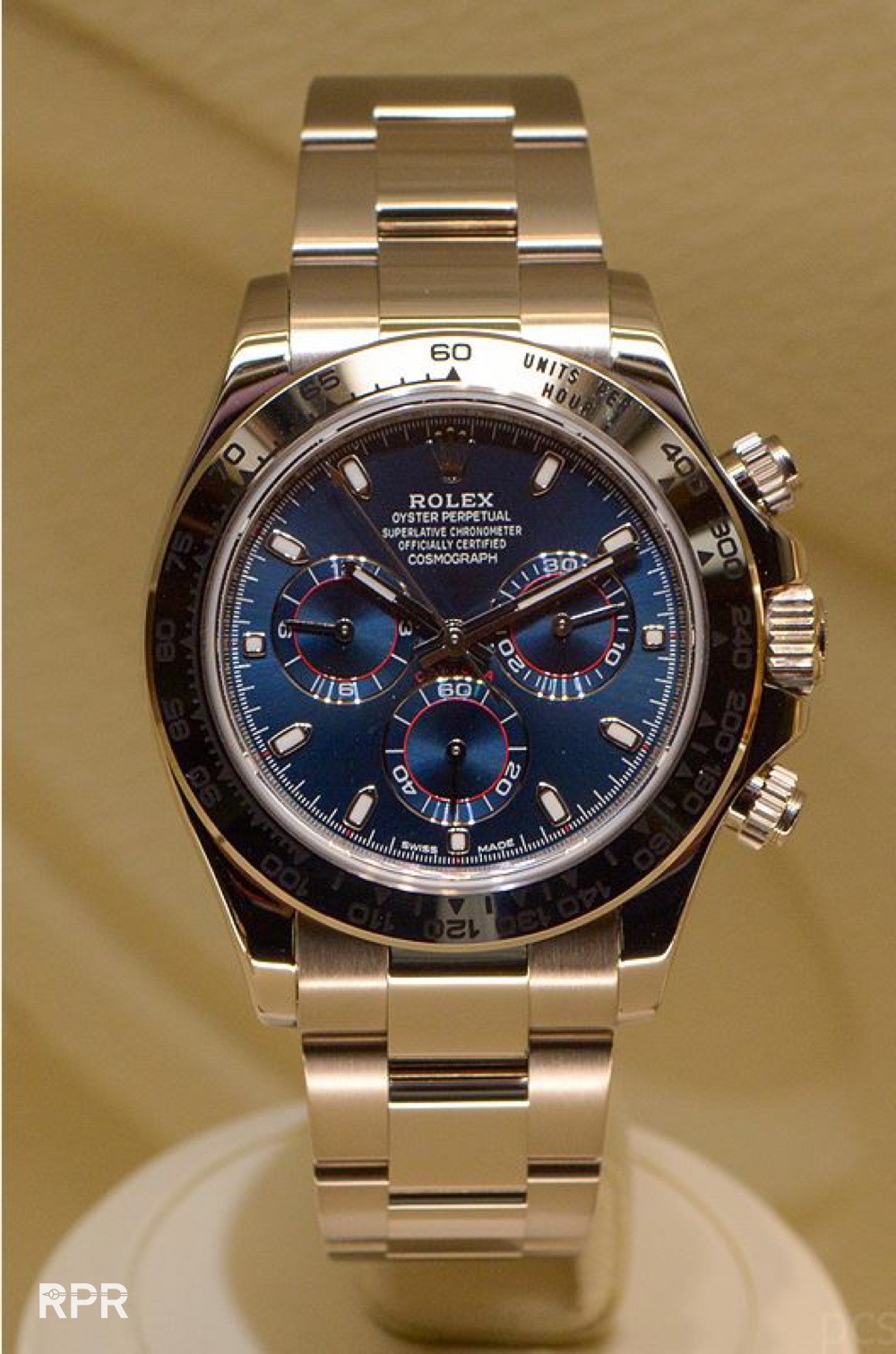
New white Gold Daytona with stunning blue dial!…
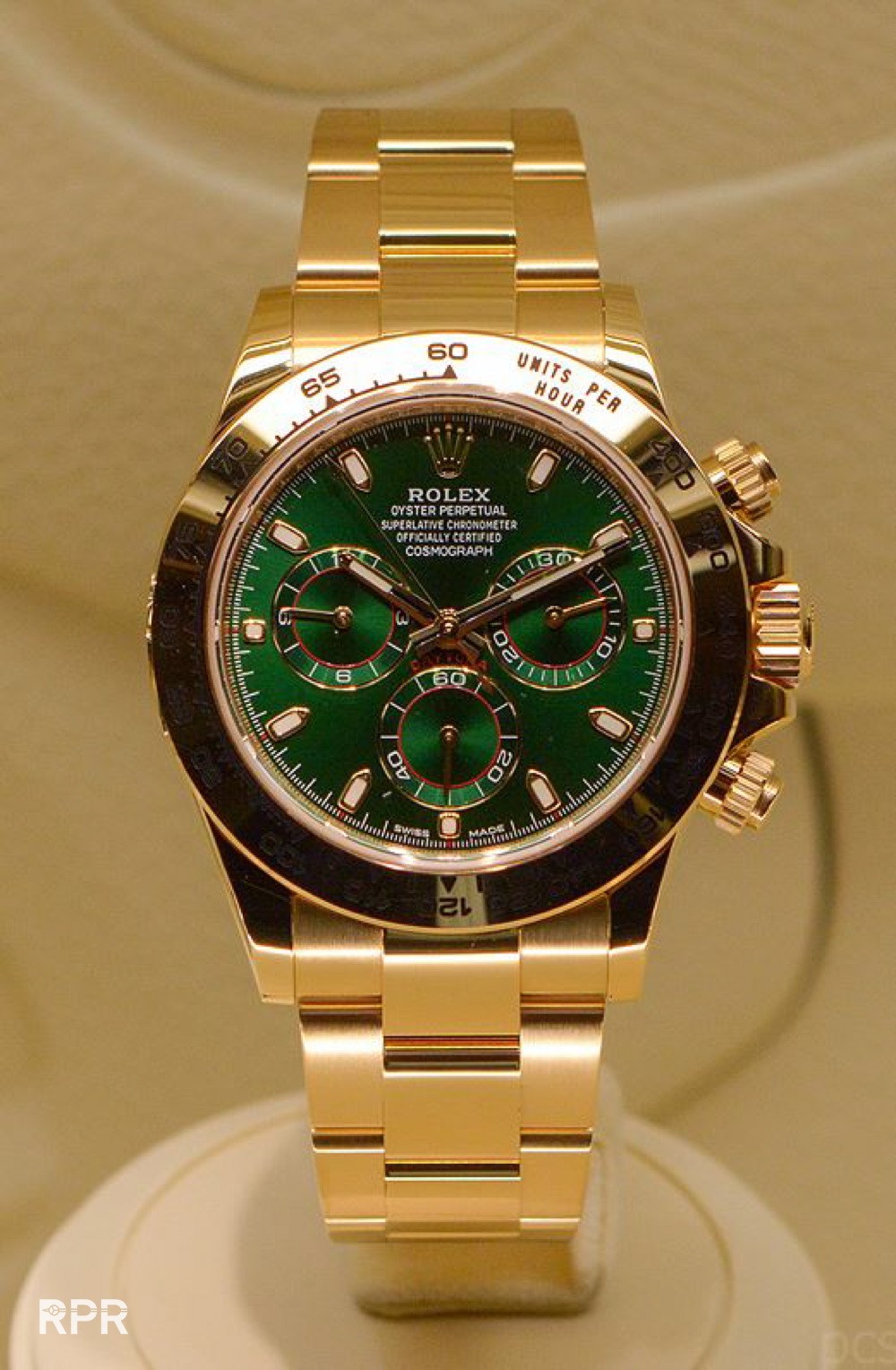
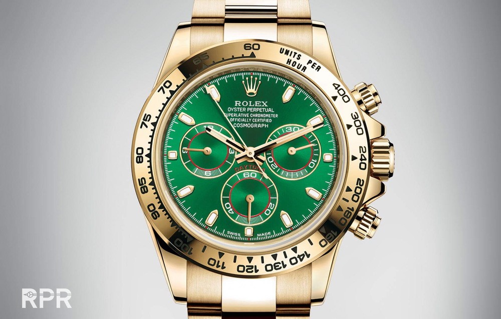
The gold Daytona gets a racing green dial…
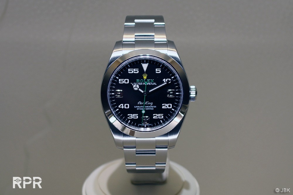
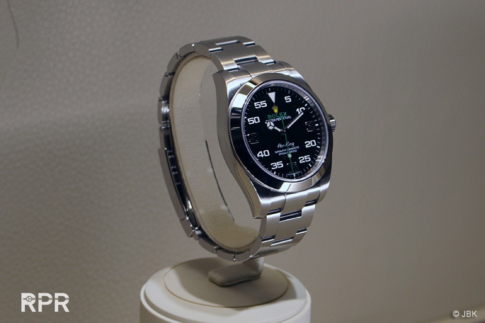
The “Hommage to Aviation” with the dial looking like the cockpit instruments specially designed by Rolex for the Bloodhount SCC ..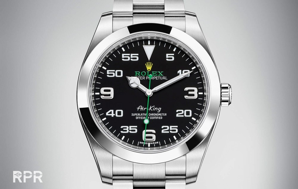
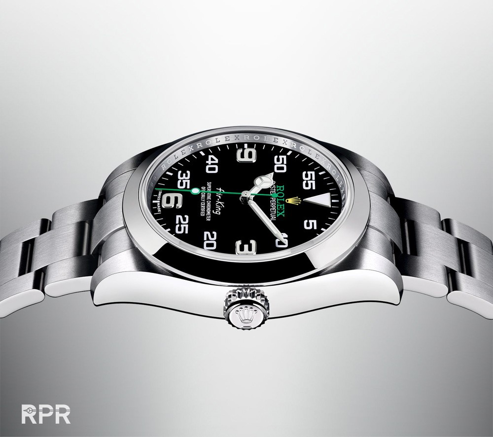
A fusion between the new black ceramic bezel and the old style white and black dial design. For me it’s ok, well done Rolex !
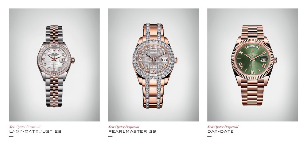
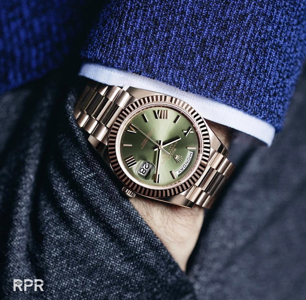
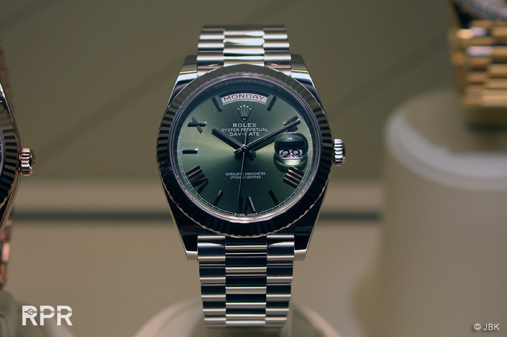
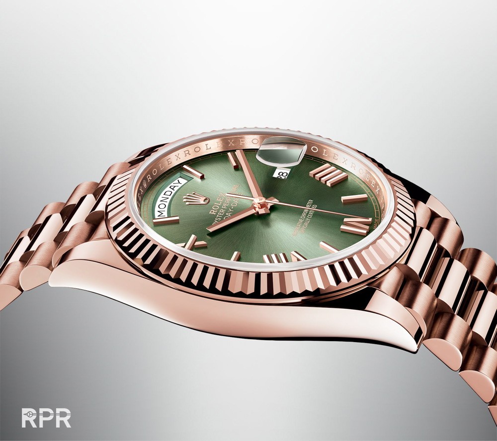
A new pink gold Day Date with greenish dial for the 40th anniversary
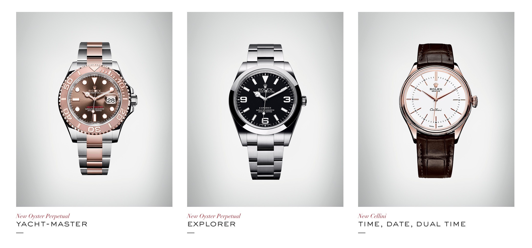
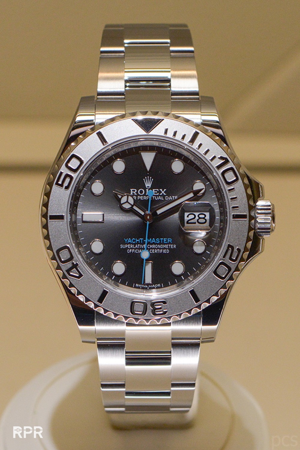
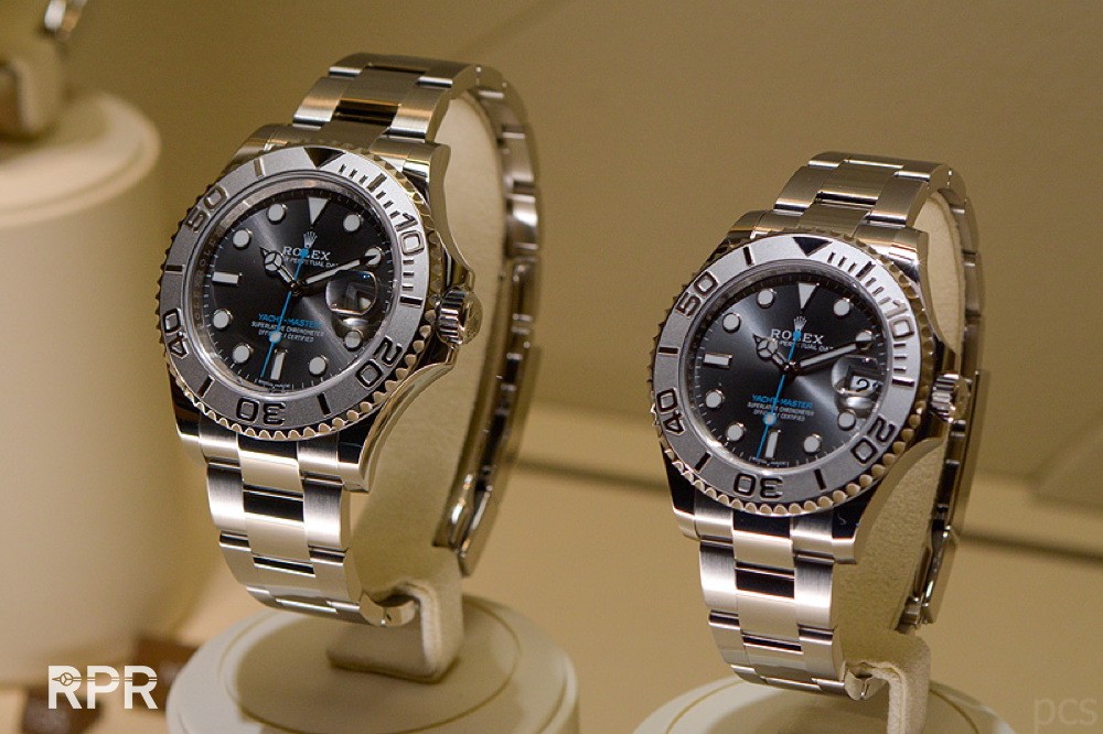
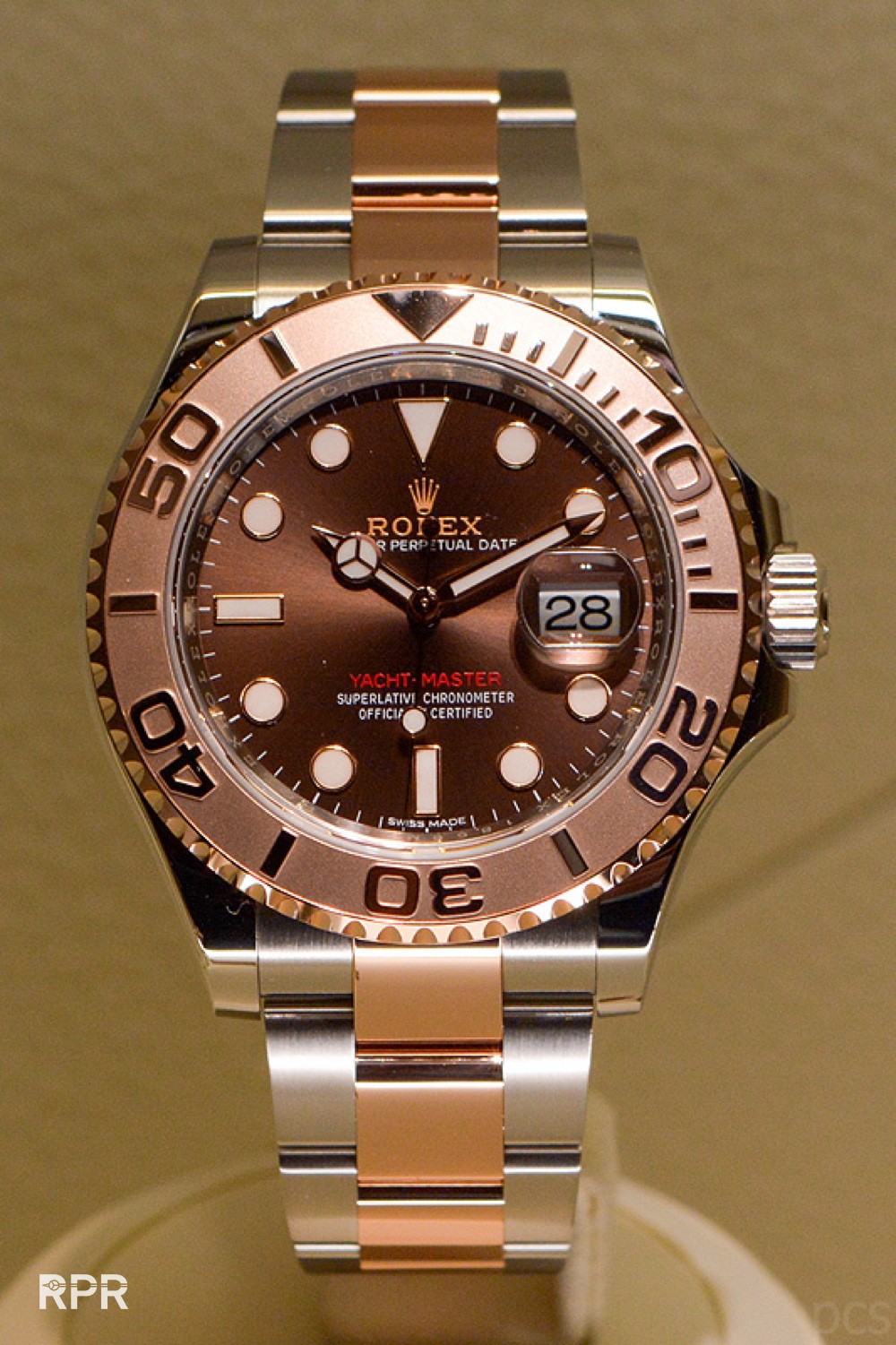
Above the new steel Yachtmasyter with modern turquoise kick. Then a new YachtMaster in bicolor with pink gold and red writing has been introduced… 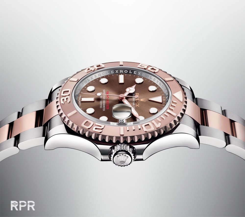
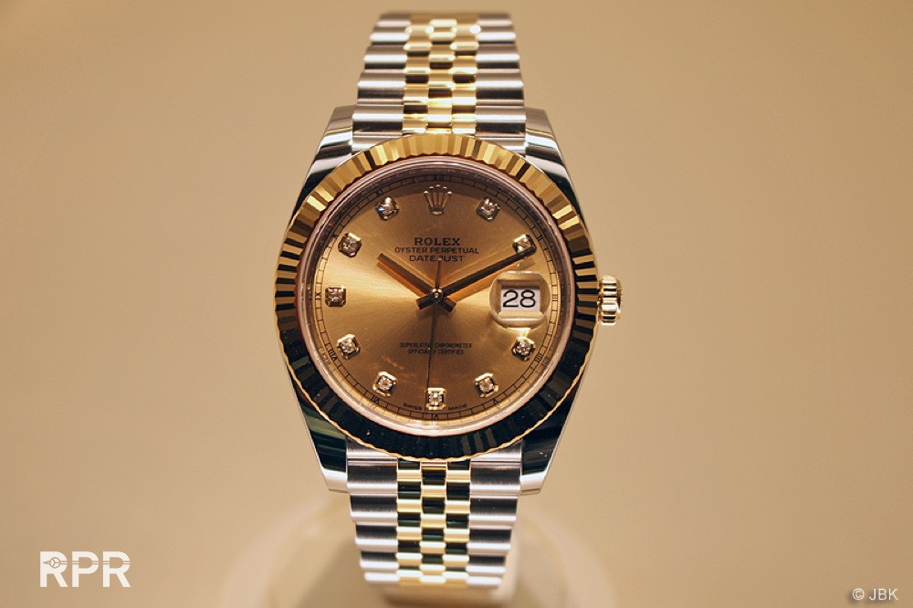
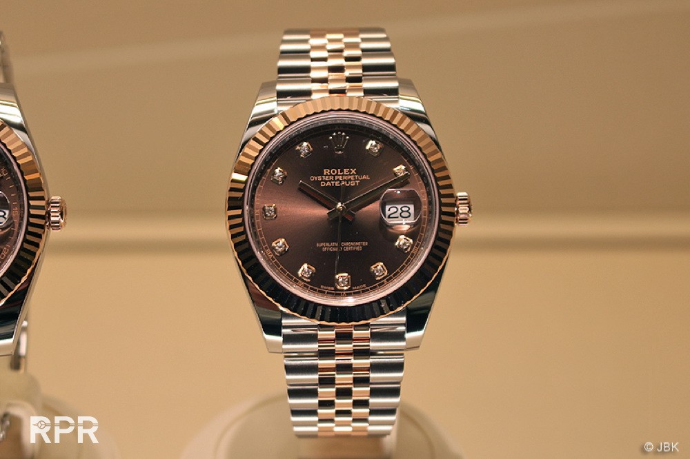
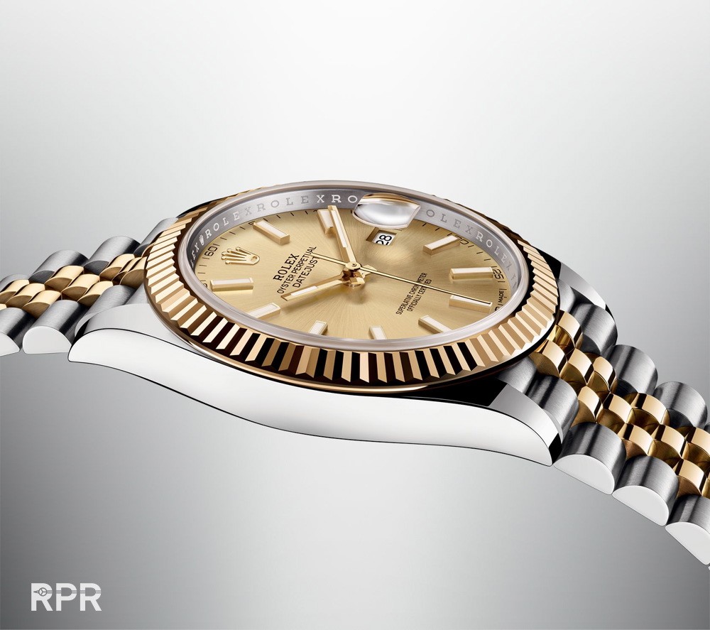
And the new 41mm Datejust…
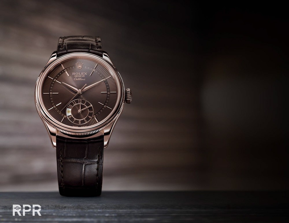
The new Rolex Cellini in pink gold…
And the white gold with blue dial for the date version of the Cellini. NO moon phase so far…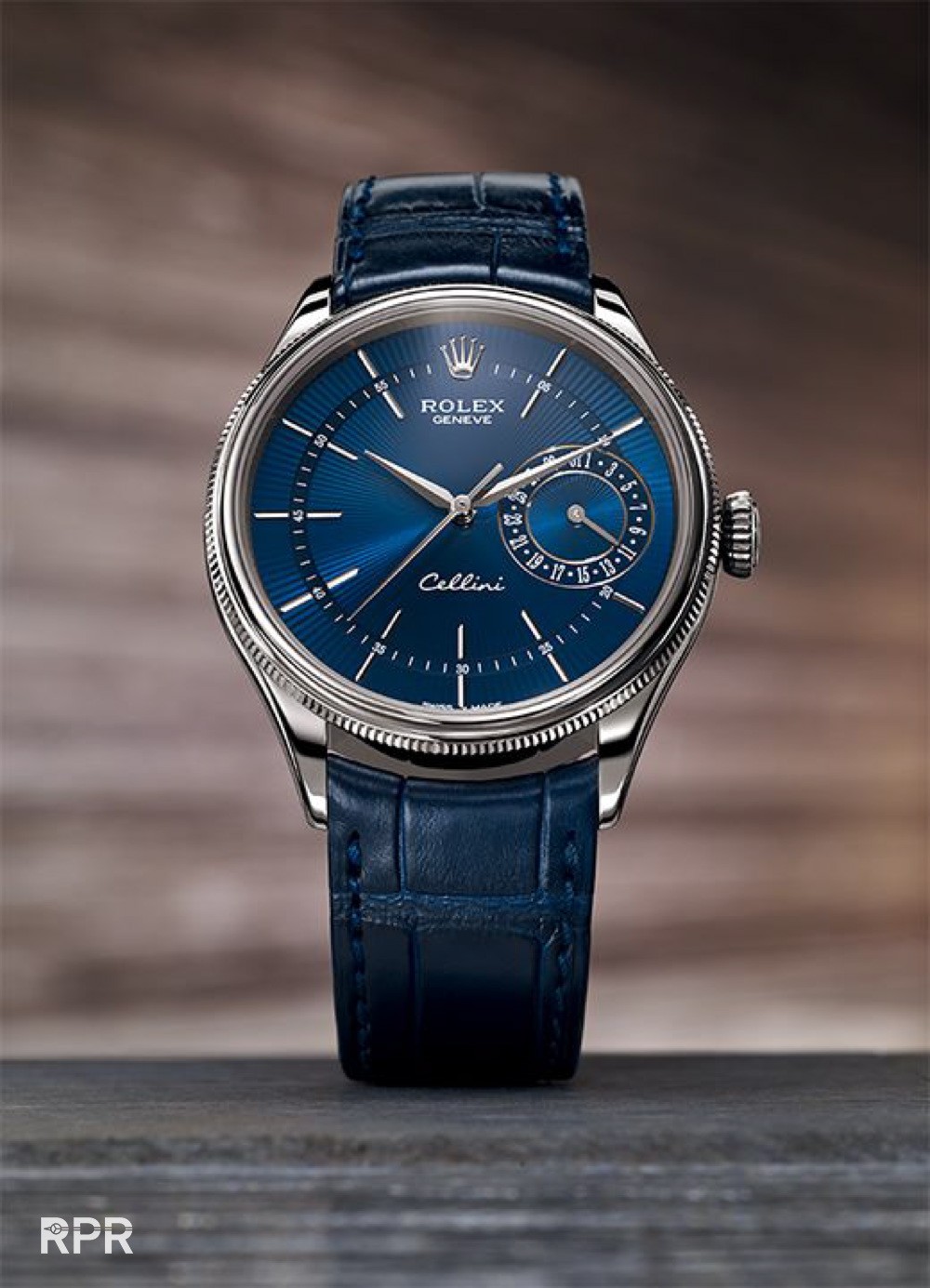
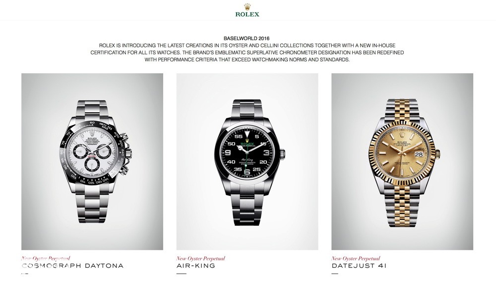
Check out all the Rolex Basel World 2016 news on their website: www.Rolex.com !!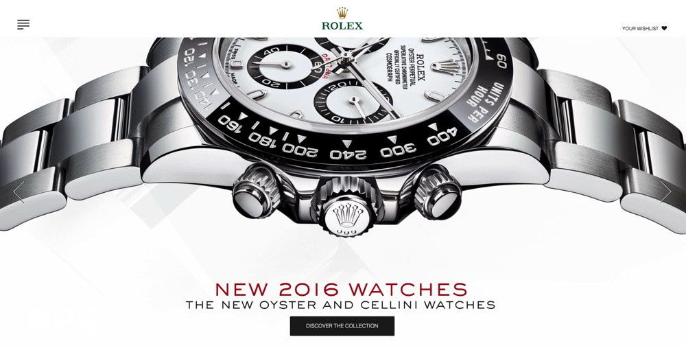
Here are some LIVE pictures made by Percy & Hannes from German Rolex Forum R-L-X. Enjoy!
To end this report for now I just want to add my interpretation of the new Daytona. Since I had some time to have a really good look at it, I come to the following conclusion. Due to the all black bezel, the white text inside is making the total design to “busy”. As the tachymeter needs to be on the bezel, I just removed the triangles making the bezel less present. Then I personally never really liked the crown guards so I removed those as well. Now the design is focusing again on the round face. Last but not least, I chanced the hands to all white with the tip of second hand of the chrono in black. Now to me it’s more serene and imho better.
What I still don’t understand is why Rolex simply used the “Gold Bezel” design for their iconic steel version? So next to each other my different version on the left & Rolex most recent version of the iconic Daytona with copy past gold bezel design…
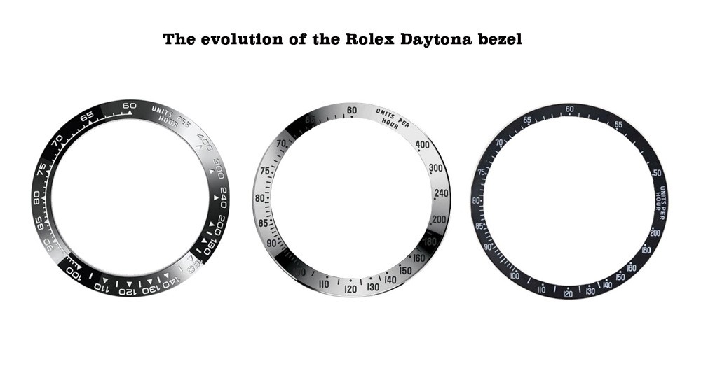
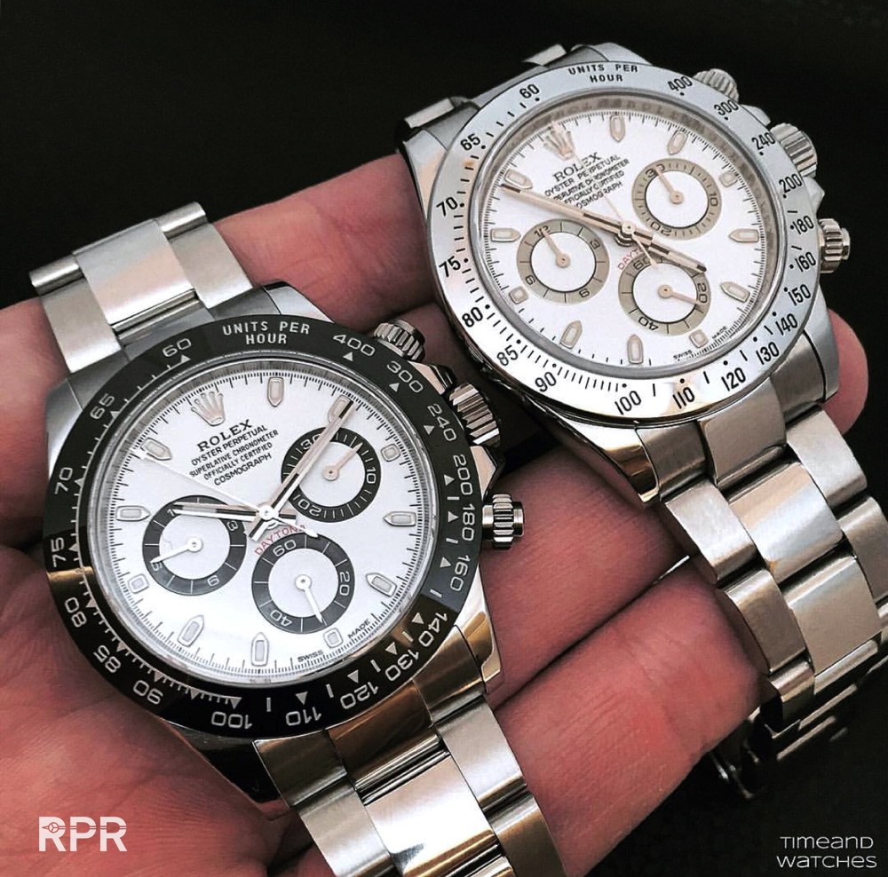
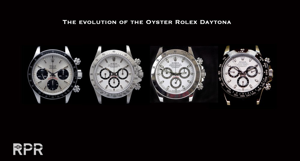
I specially made an overview for you so you can easily see the differences of the Rolex Daytona Bezels we’ve had so far. It’s hard to defend that the new ceramic bezel is having the correct lay out, specially when you compare it with the previous versions. Something went wrong at Rolex and I really wonder if this quick solution of adding the gold bezel design to the new steel Ref 116500LN isn’t a bit too easy, read lazy. Honestly I think the legendary steel Daytona deserves better Rolex presented us…
Here’s Roger Federer wearing the new steel Daytona….
I found this comparison of the 2 last Daytona models next to each other where we clearly notice the different bezel design.
Find below an overview of the evolution of the “Oyster Daytona” I specially put together to show you the differences.


