The History of the Exotic Rolex Paul Newman Dial Designs…
Studying Exotic Rolex Paul Newman Dial Designs…
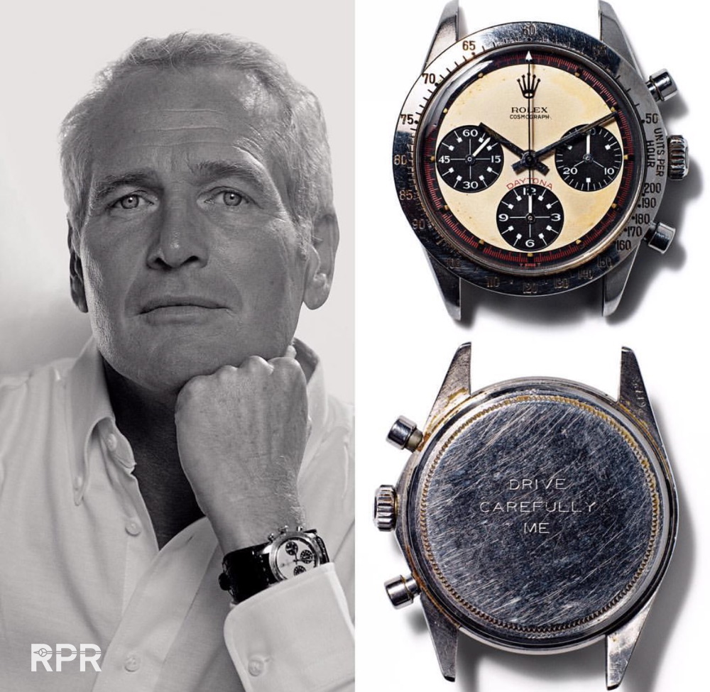
Updated: After Mr. Paul Newman’s Rolex nicknamed alias “Paul Newman Daytona” sold for nearly $ 18 million at Phillips in New York the awareness for Rolex Paul Newman’s have exploded even further. It has become the must have vintage Rolex and vintage watch in general and prices are exhilarating to peak this upcoming weekend when Phillips will yet again write history with their dedicated Daytona Ultimatum auction. Questions rise why exactly this exotic Rolex dial design made it to the top when other brands have used same elements. In this article I tried to explain you where this Paul Newman dial came from and why it has so immense populair…
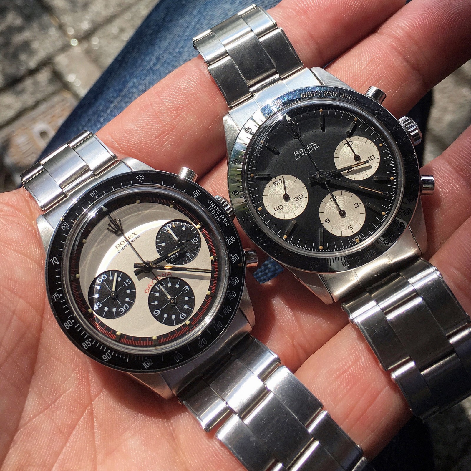
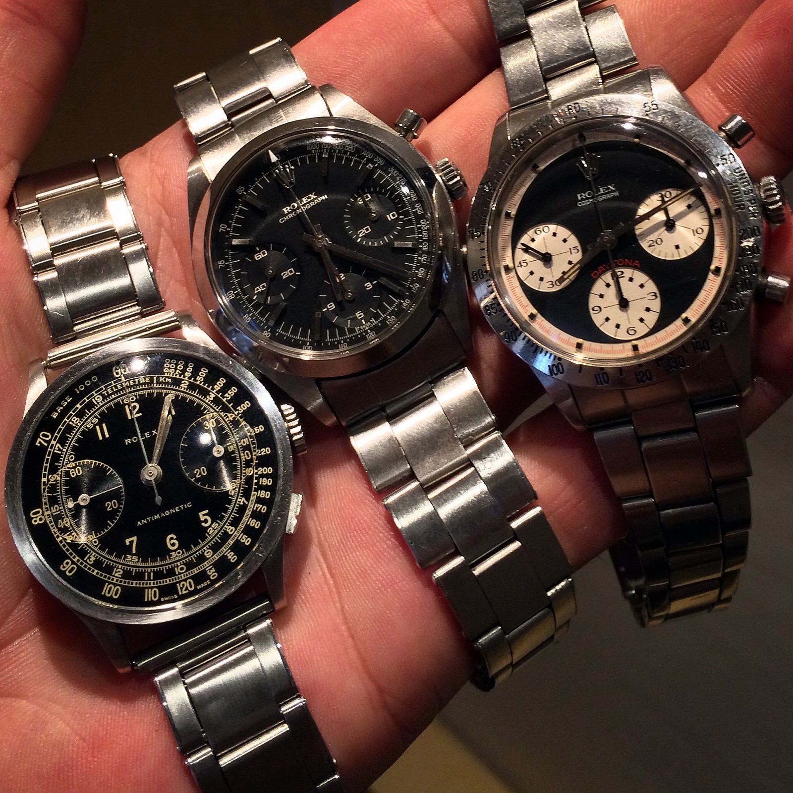
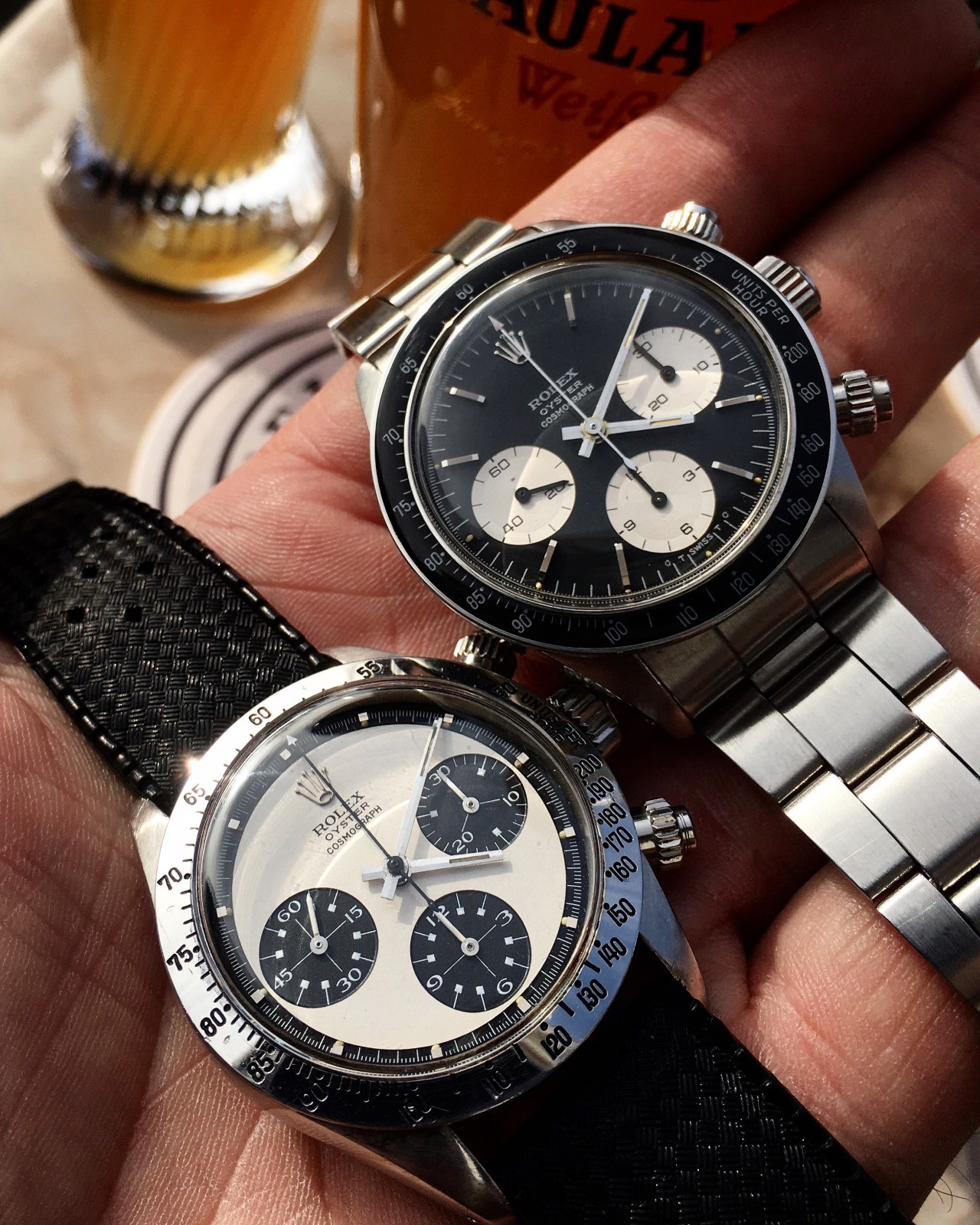
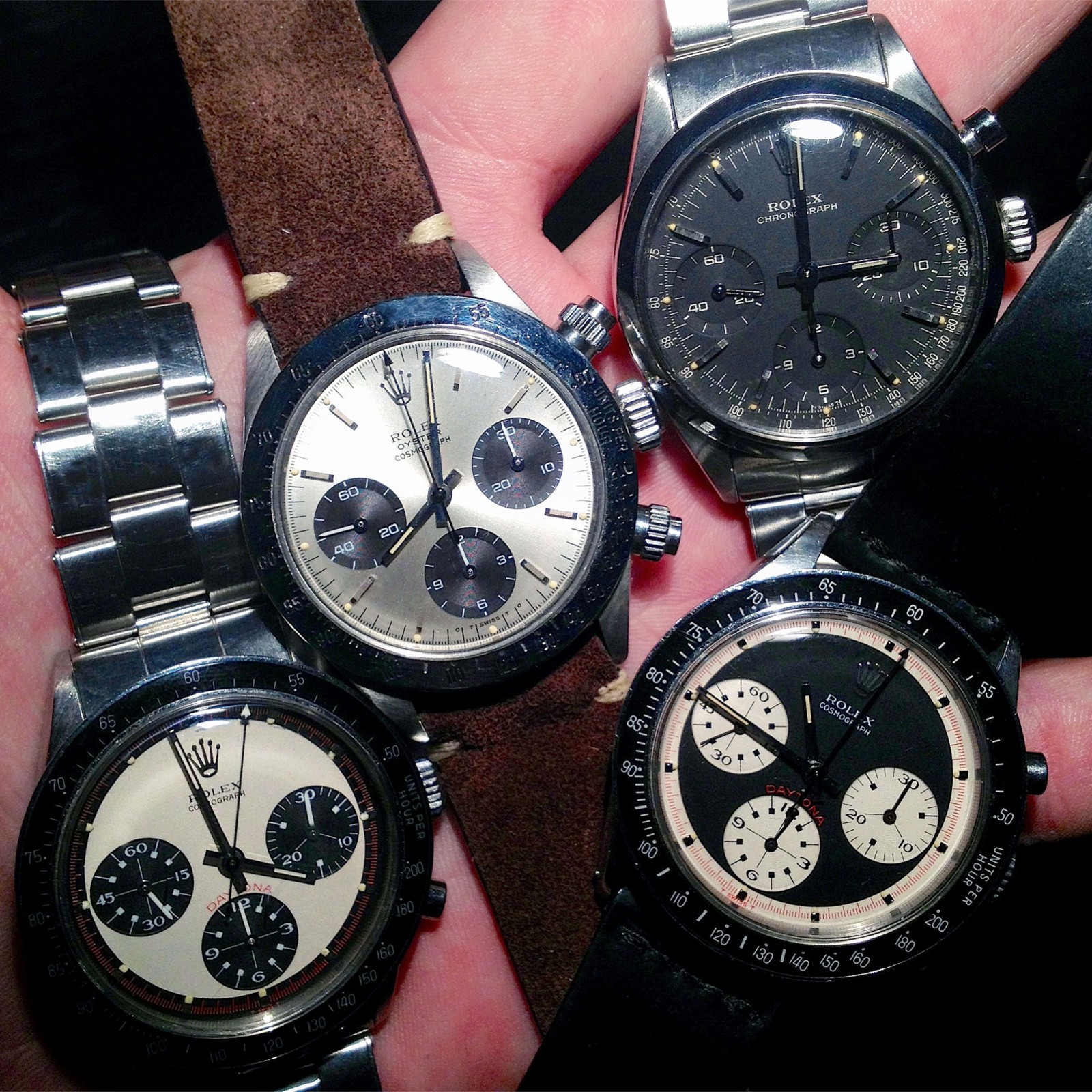
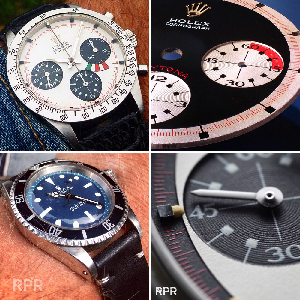
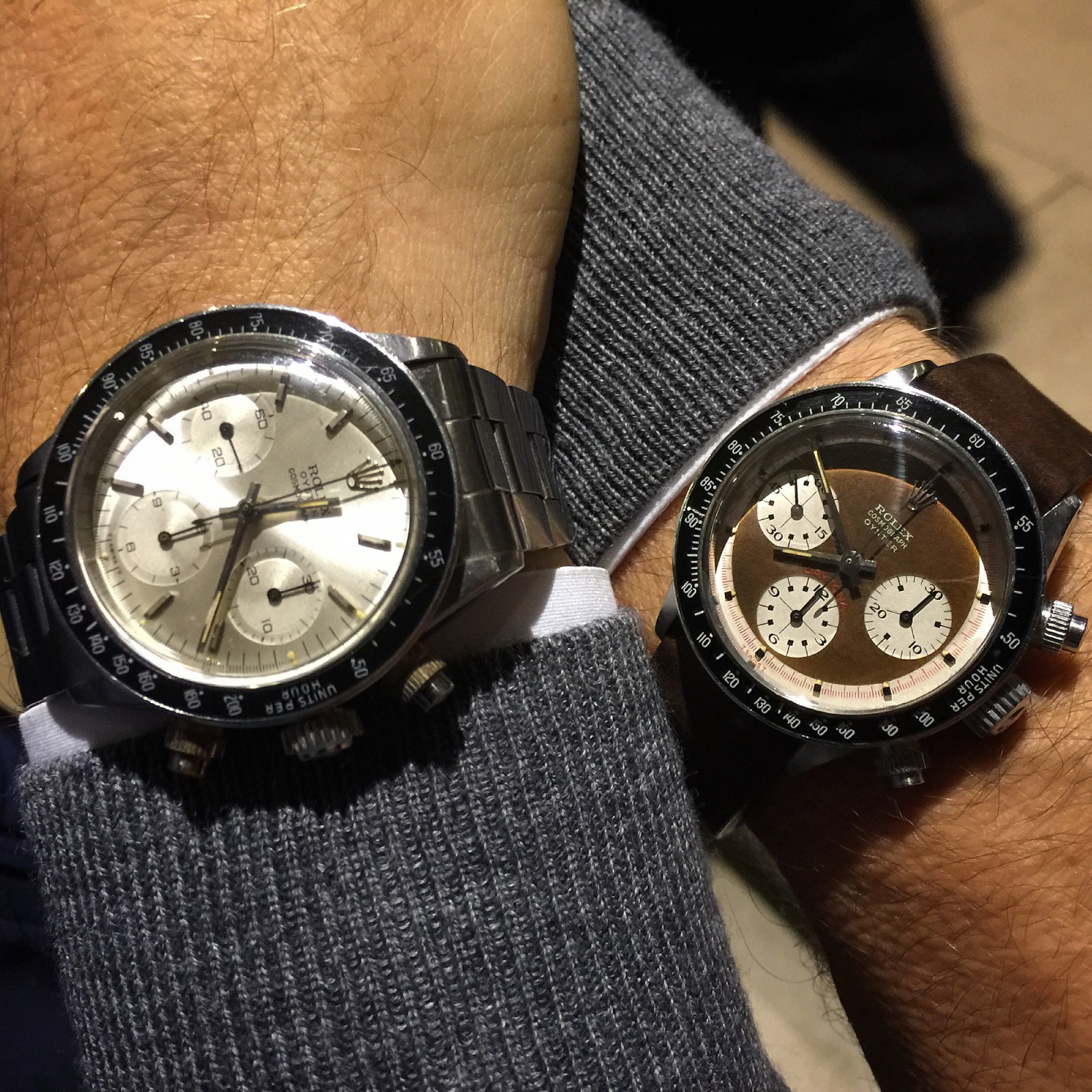
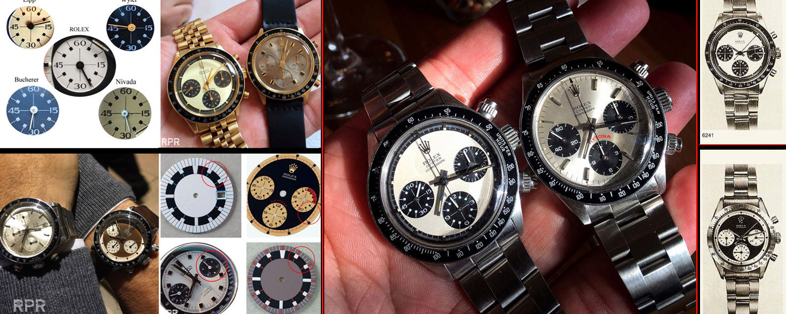
Now what is so striking on a Rolex Paul Newman dial design? For this we need to compare the first Daytona designs with the later Exotic’s. For example here’s one of the very first Daytona Ref 6239 with black “Double Swiss” from 1963 next to a 3 color pump Paul Newman Daytona from 1969. Clearly the Newman design is much more colorful and refined, more “Exotic”…
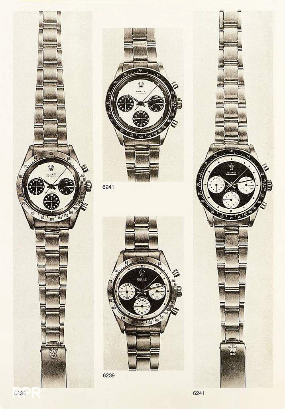
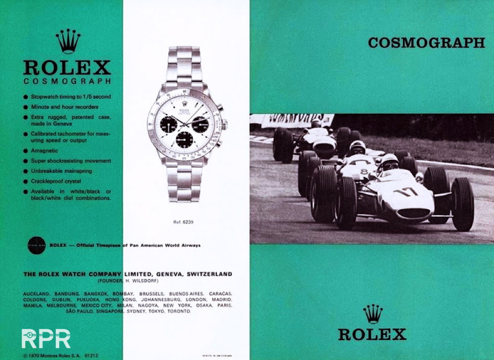
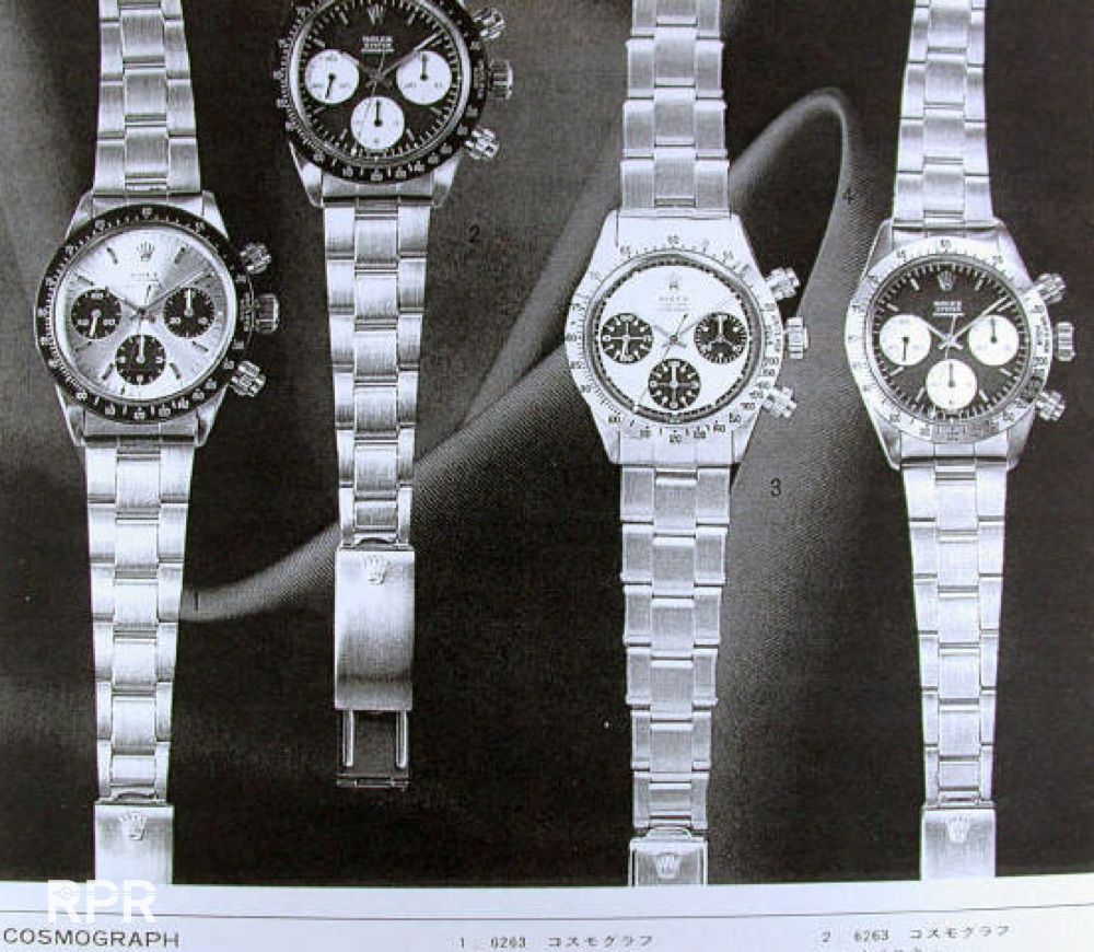
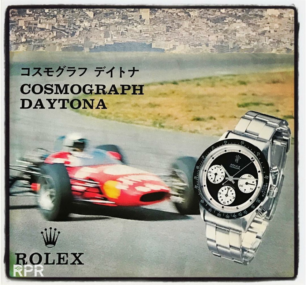
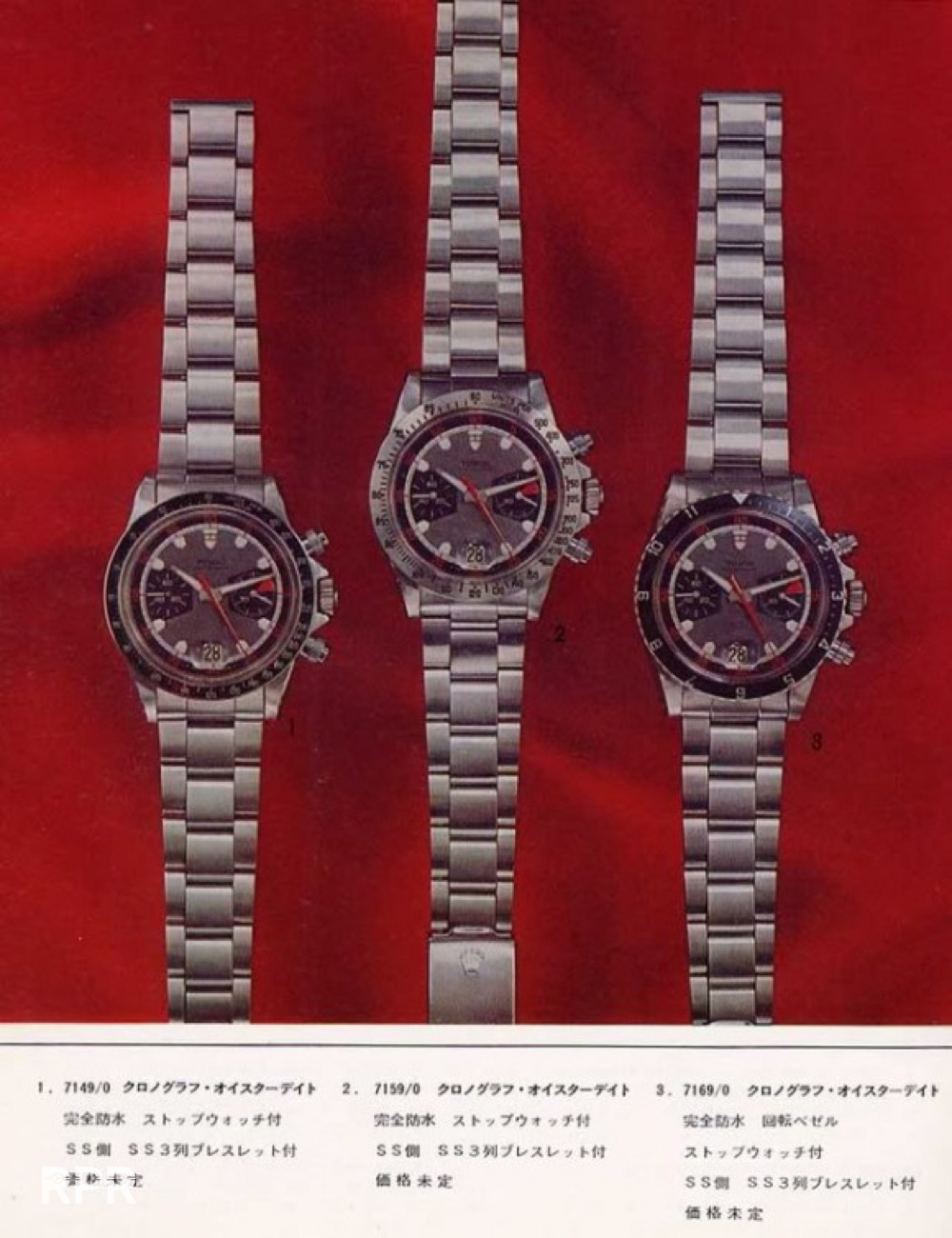
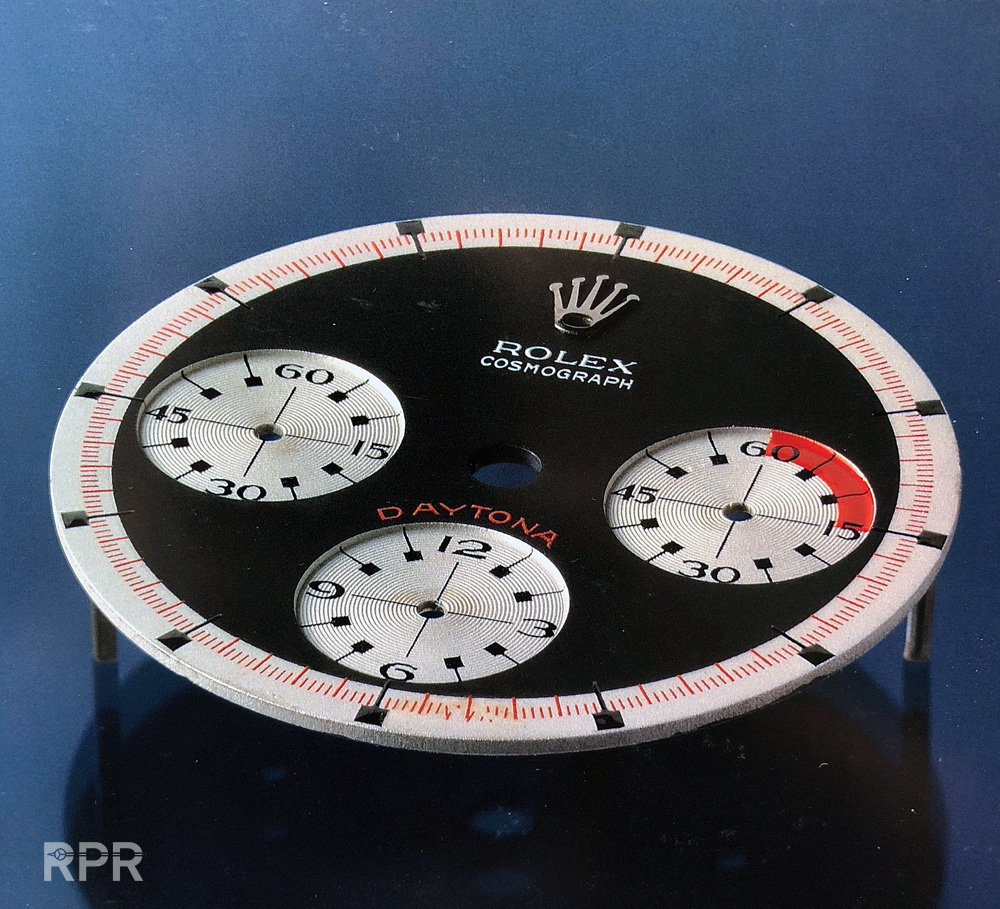
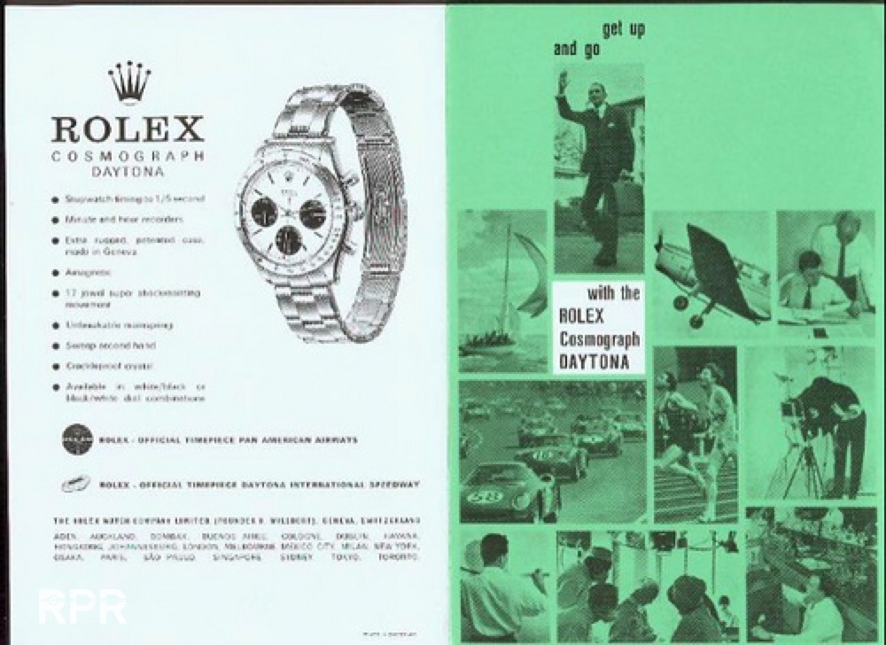
Original Rolex Catalogue showing the Paul Newman Daytona designs…
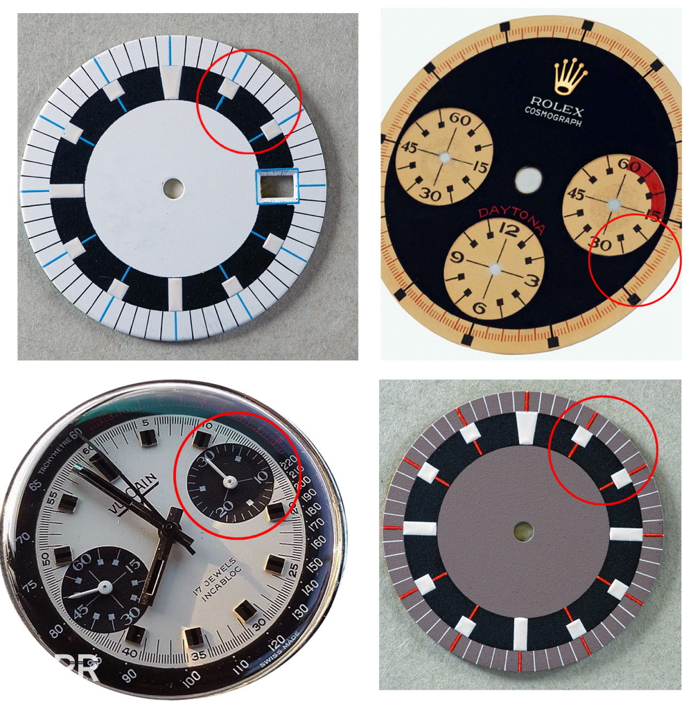
Lets go back to the evolution of the Rolex chronograph dial design with following picture I made. We see a very early, square pusher Rolex Chronograph Ref 2508 from the 40-ies with telemeter index on the dial, A Pre-Daytona Ref 6238 with black dial also with the telemeter index much smaller but still on the dial. From the first Ref 6239 design as seen above, the telemeter disappeared from the dial and was clearly printed on the wider bezel to increase visibility…
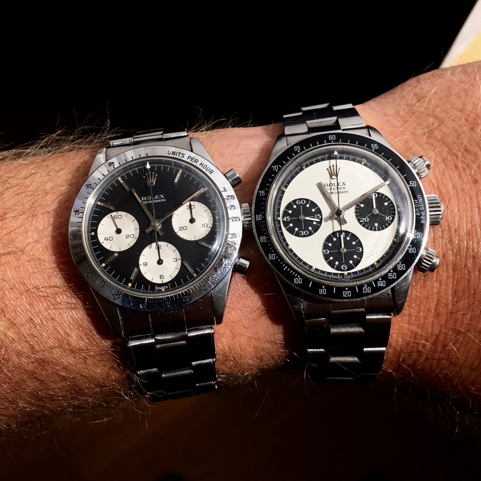
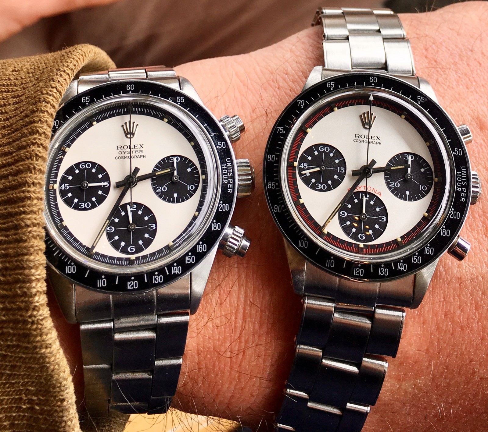
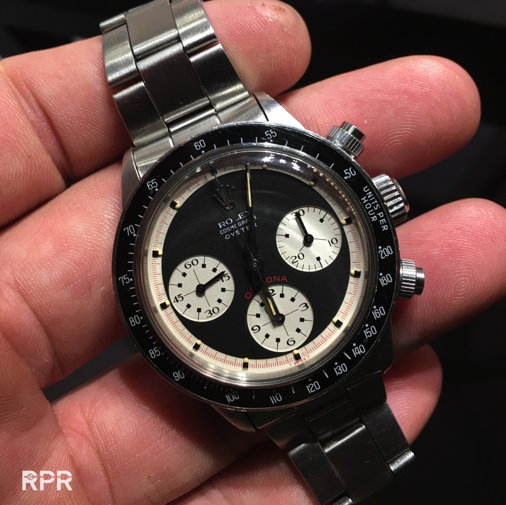
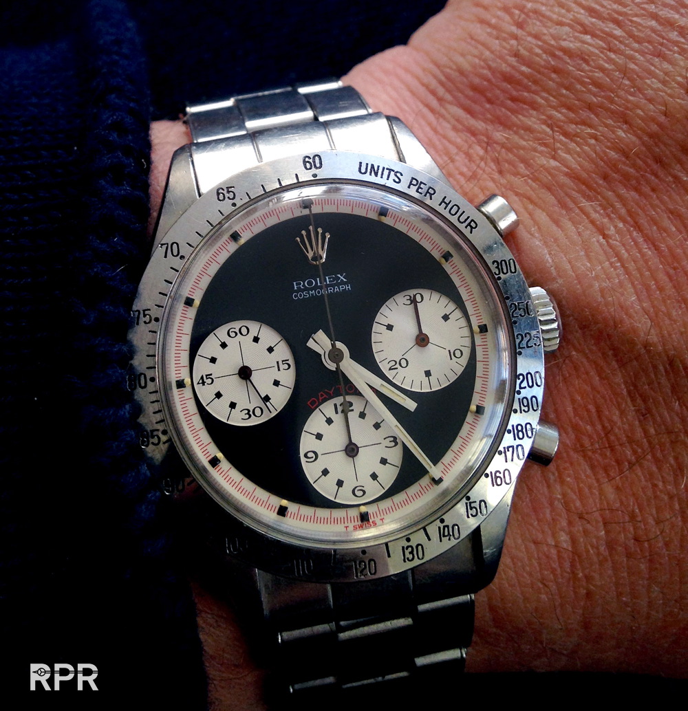
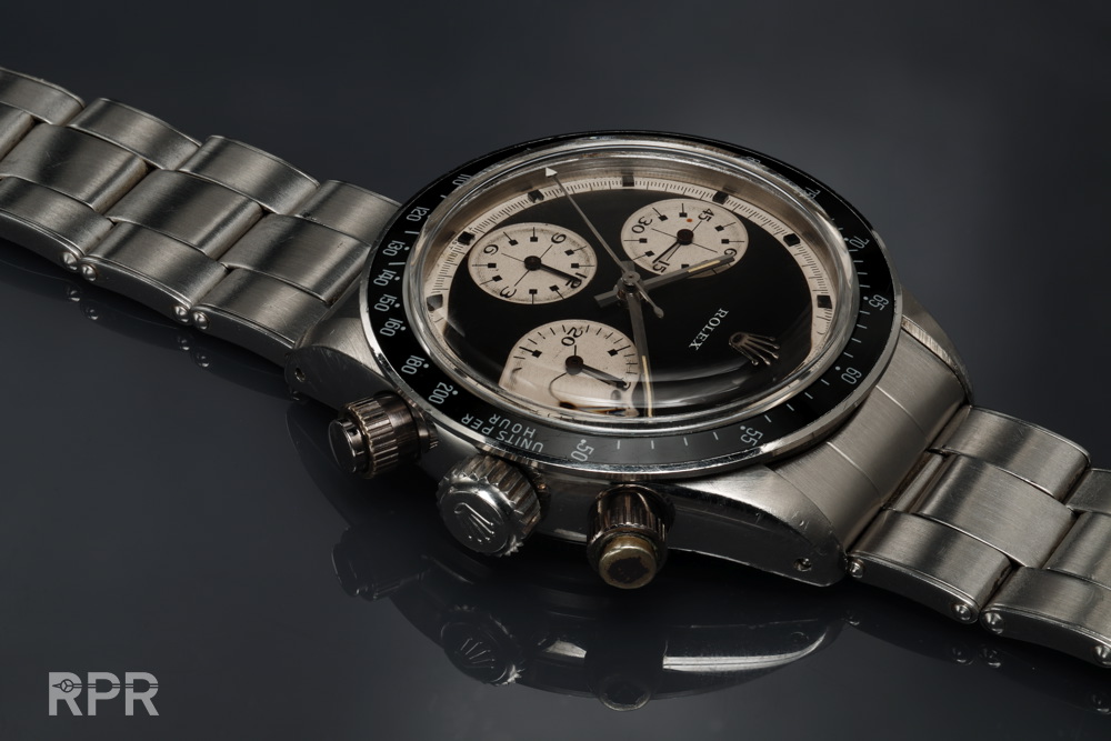
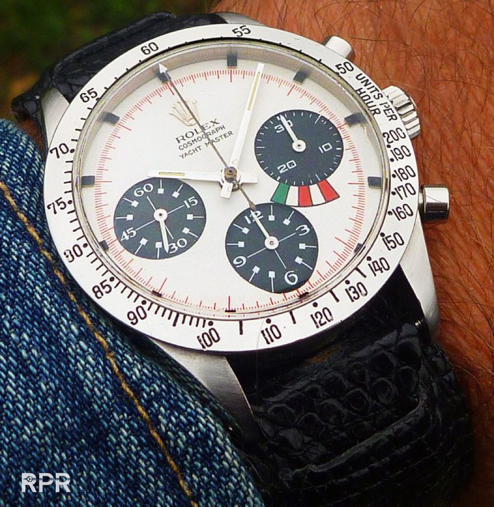
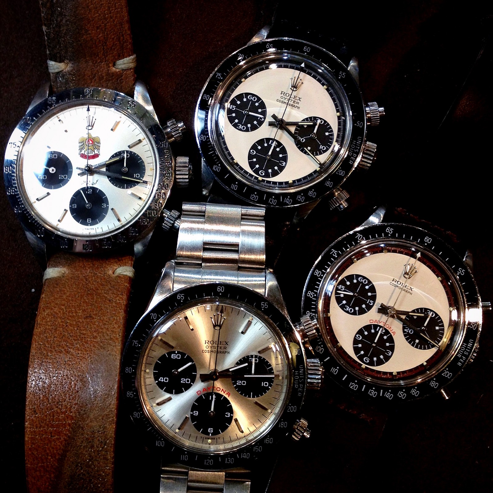
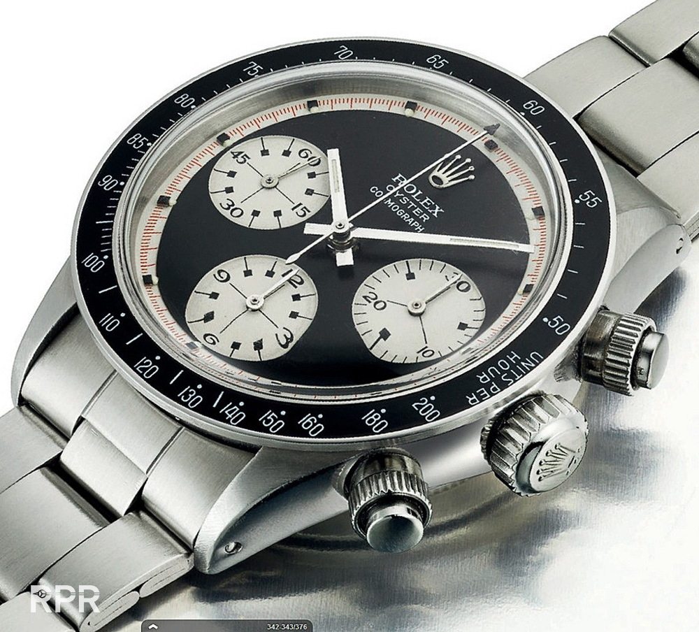
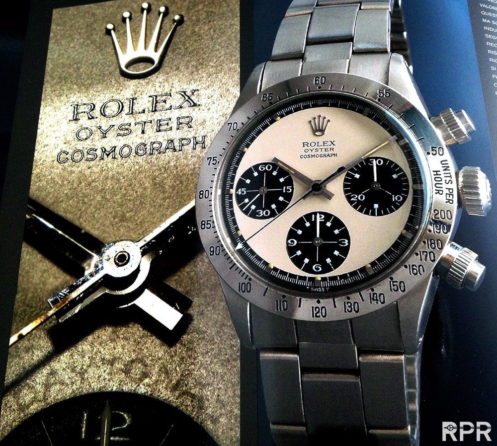
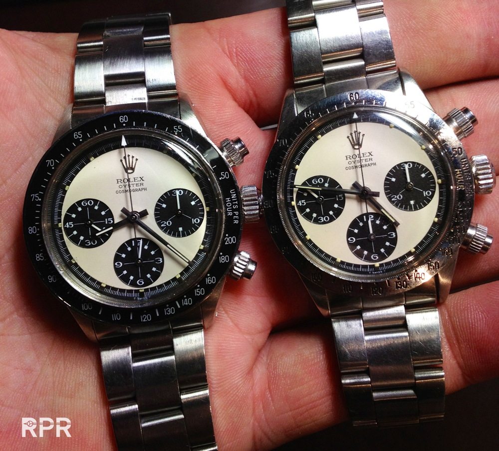
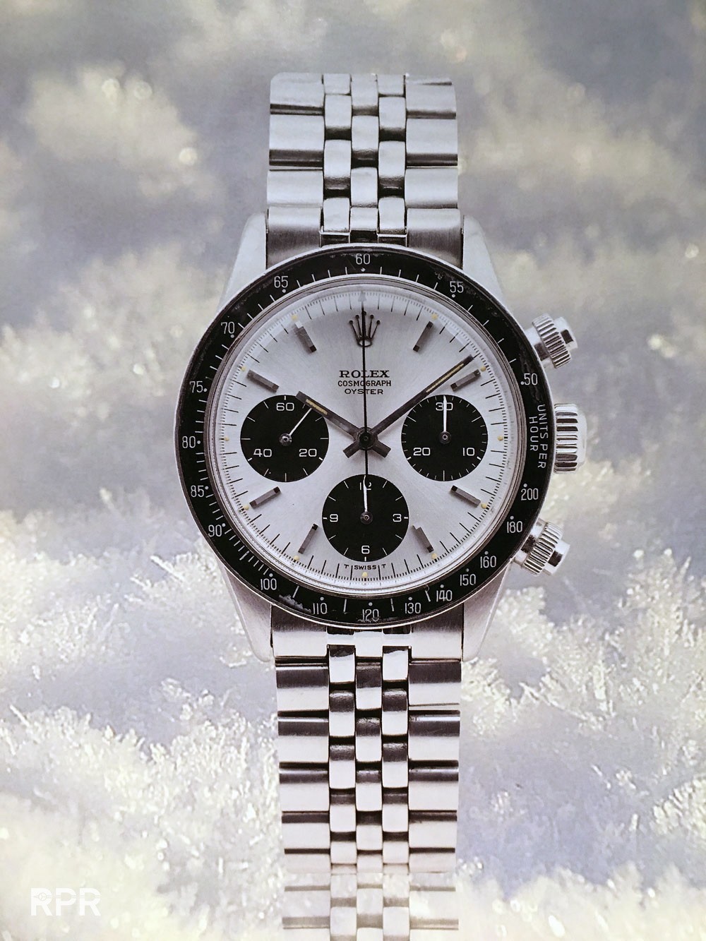
In below picture you see the obvious differences between a regular Daytona and a Paul Newman, in this the last Oyster Paul Newman version.
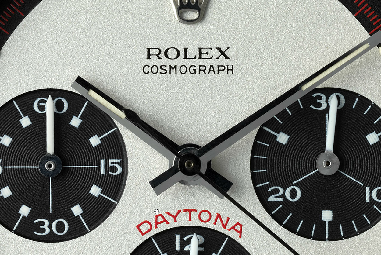
- With the Paul Newman design the outside minute track is contrasting, making the dial at first look smaller but in this case the black bakelite bezel pops out the lay out.
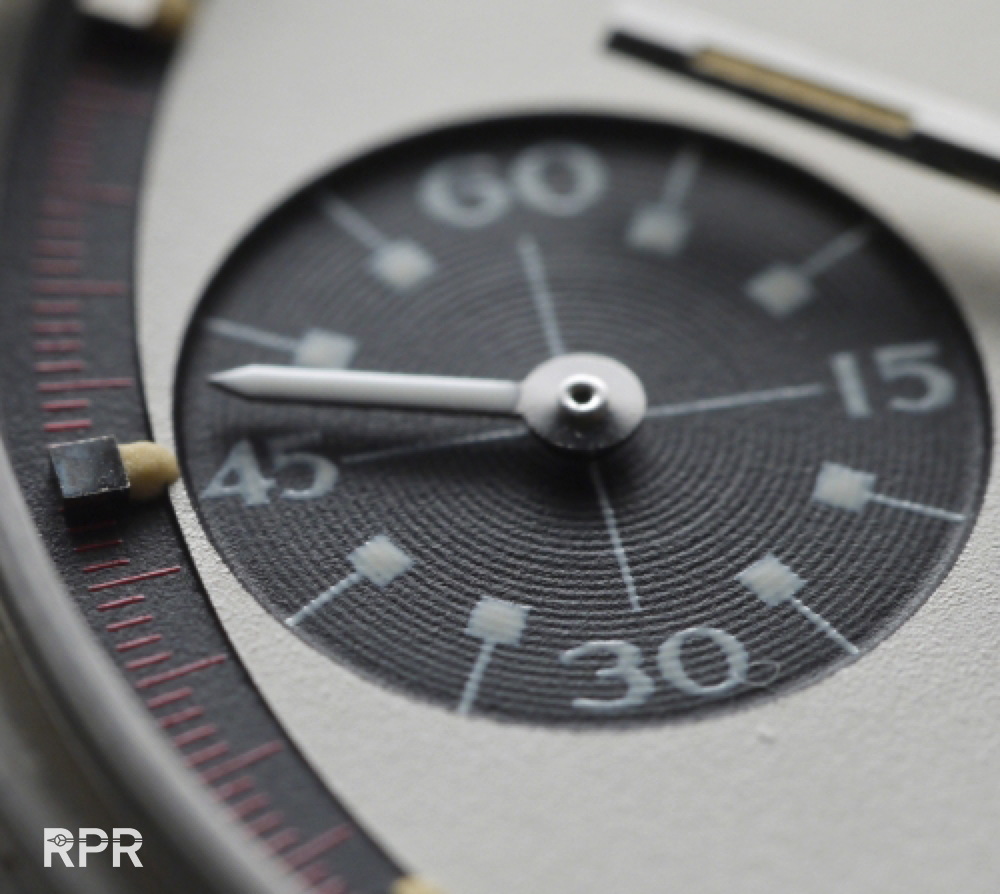
- Next are the typical lollipop index with square tops printed in the sub-dials making it totally different and much more visible then regular dial.
- Last difference are the much shorter indexes added on the dial. The Newman’s have square indexes matching the printing in the sub-dials, which marvelously matches in heaven.
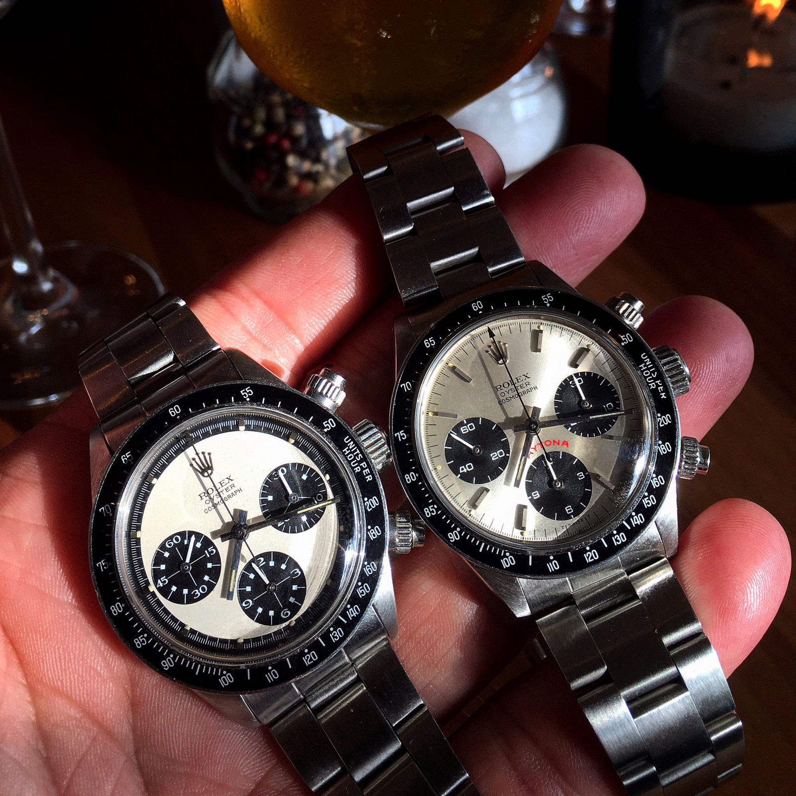
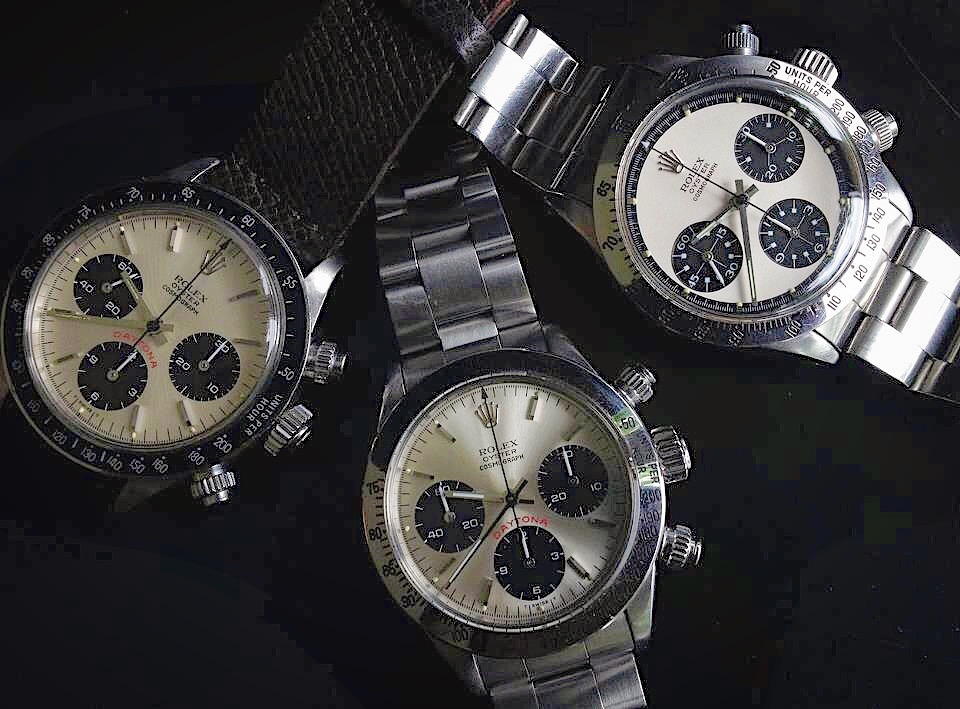
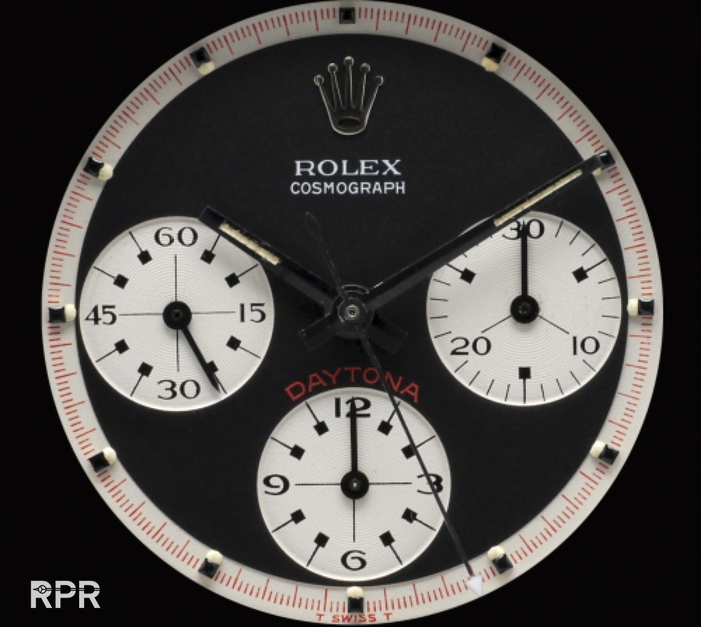
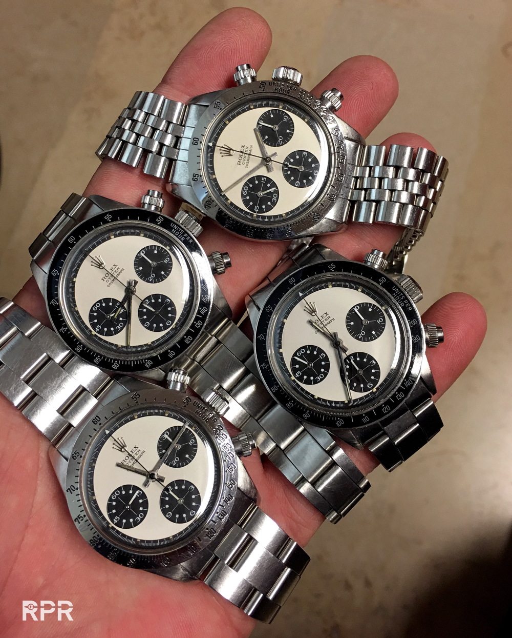
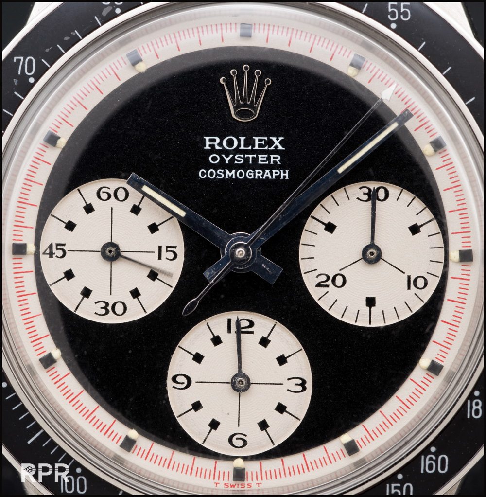
Below another clear example between the “Panda” & “Oyster Paul Newman”, both 6263 and completely different. There where the silver soigné Panda Daytona dial is for every Rolex collector a dream, the Oyster Paul Newman is for me personally much more exciting in black and white geometric. Everything is in balance with the Oyster PN, the white hands in the sub-dials, the hands matching the index, the minimum of text on the dial, just perfect!
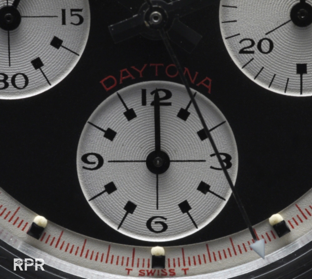
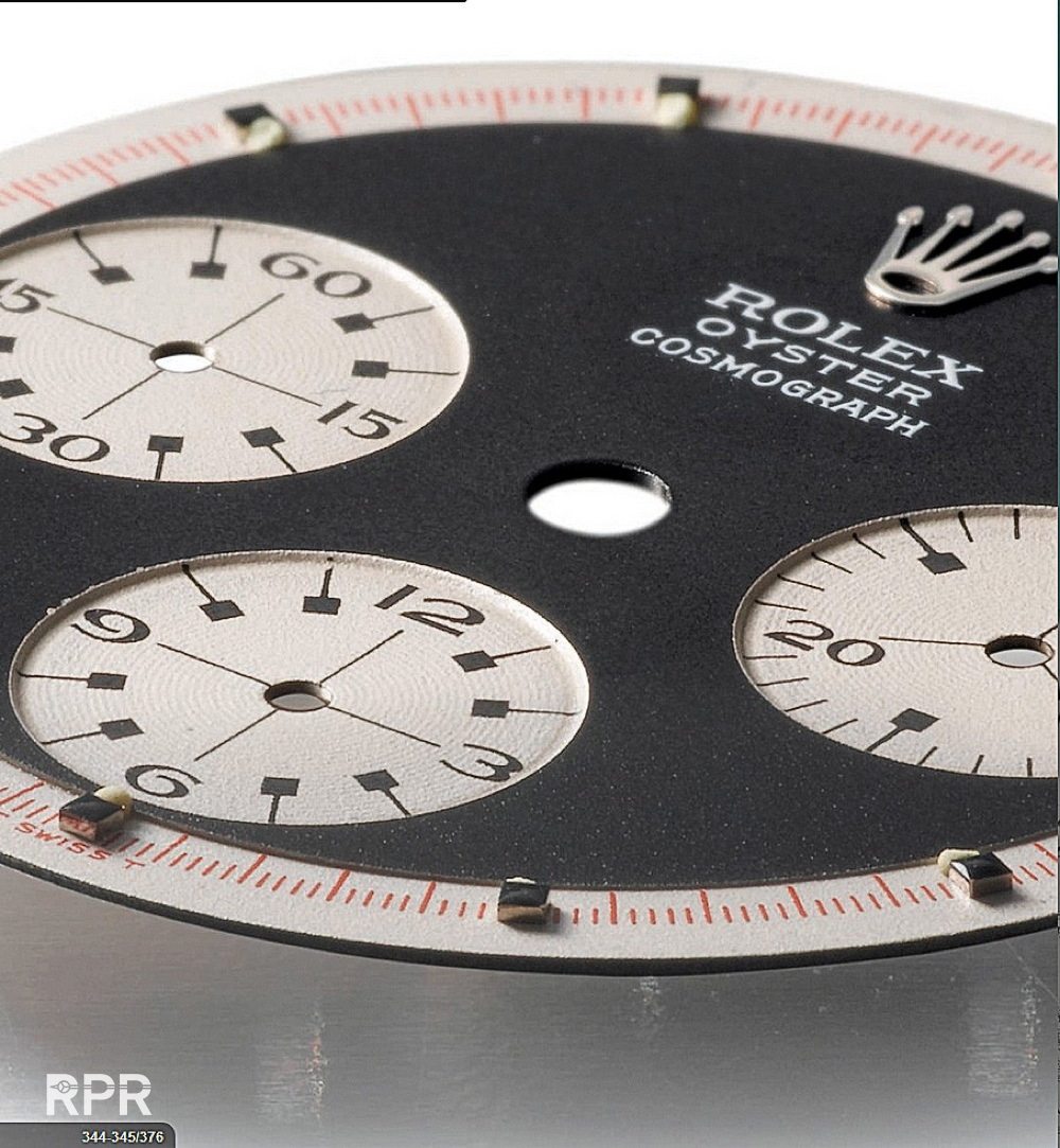
Below I try to show you the differences of the 2 dial designs. The regular Daytona dial is made like most Chronograph dials where made and thats flat. The Paul Newman dial design has a step on the outside & sub dials and the printing is much more catchy!
- In a total of 9 years ( 1963 – 1972) 14.000 Daytona’s ref 6239 of which estimated 3 % where gold cases ( only 420! )
- The 6241 was made 2300 in stainless steel and 700 x in gold.
- From 1965 – 1969 a total of 1700 Oyster Daytona Ref 6240’s have been made.
- In almost 20 years, the Ref 6263 & 6265 are estimated at 24.000 in steel, less then 10 % in gold cases (<2400! )
- So in total 16.300 Pump Daytona’s have been ( 6239, 6241, 6262, 6264) made of which 1120 where gold.
- Totally 25.700 in steel & 2400 in gold Oyster Daytona ( 6240, 6263, 6265) have been made.


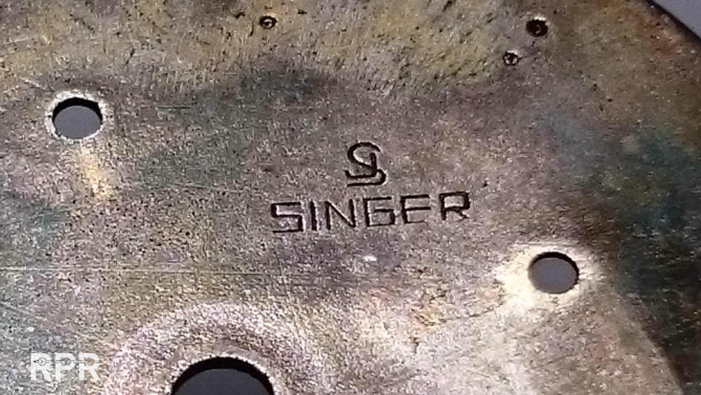
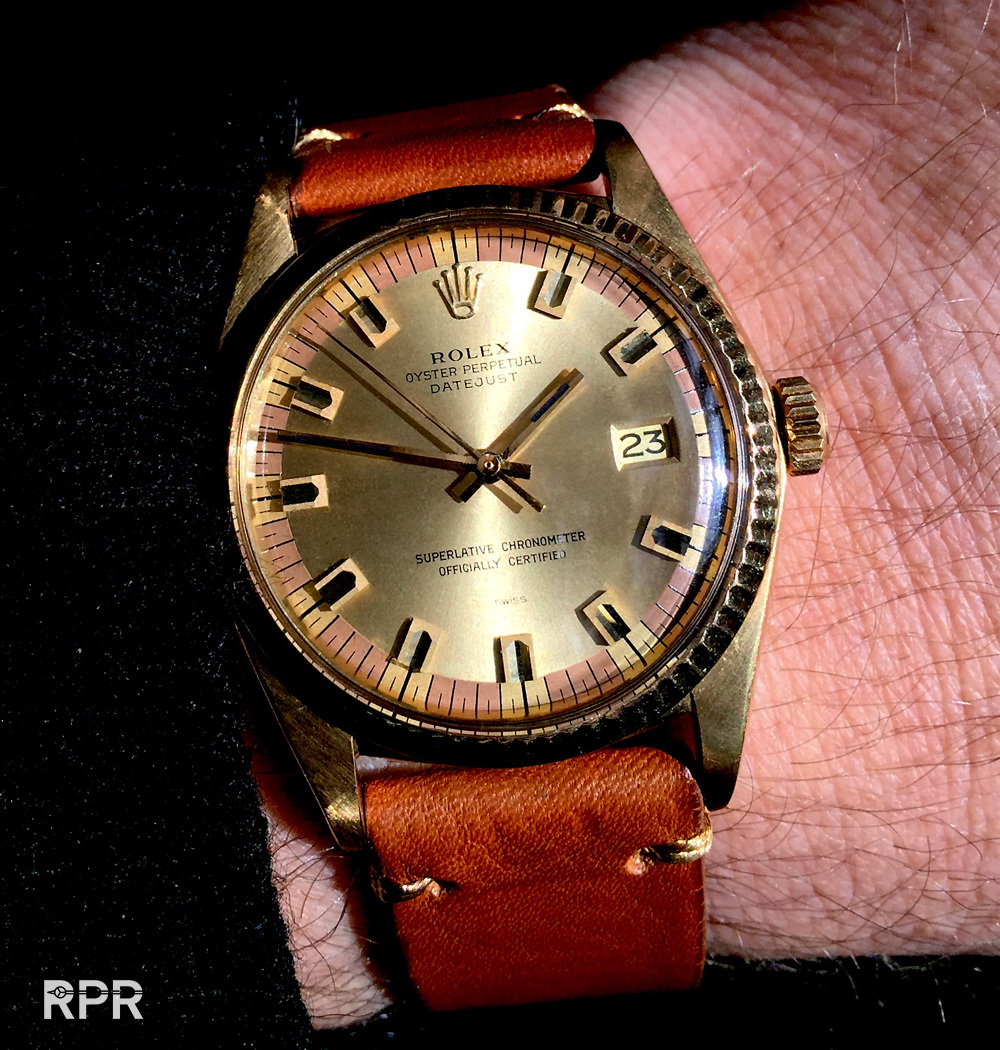
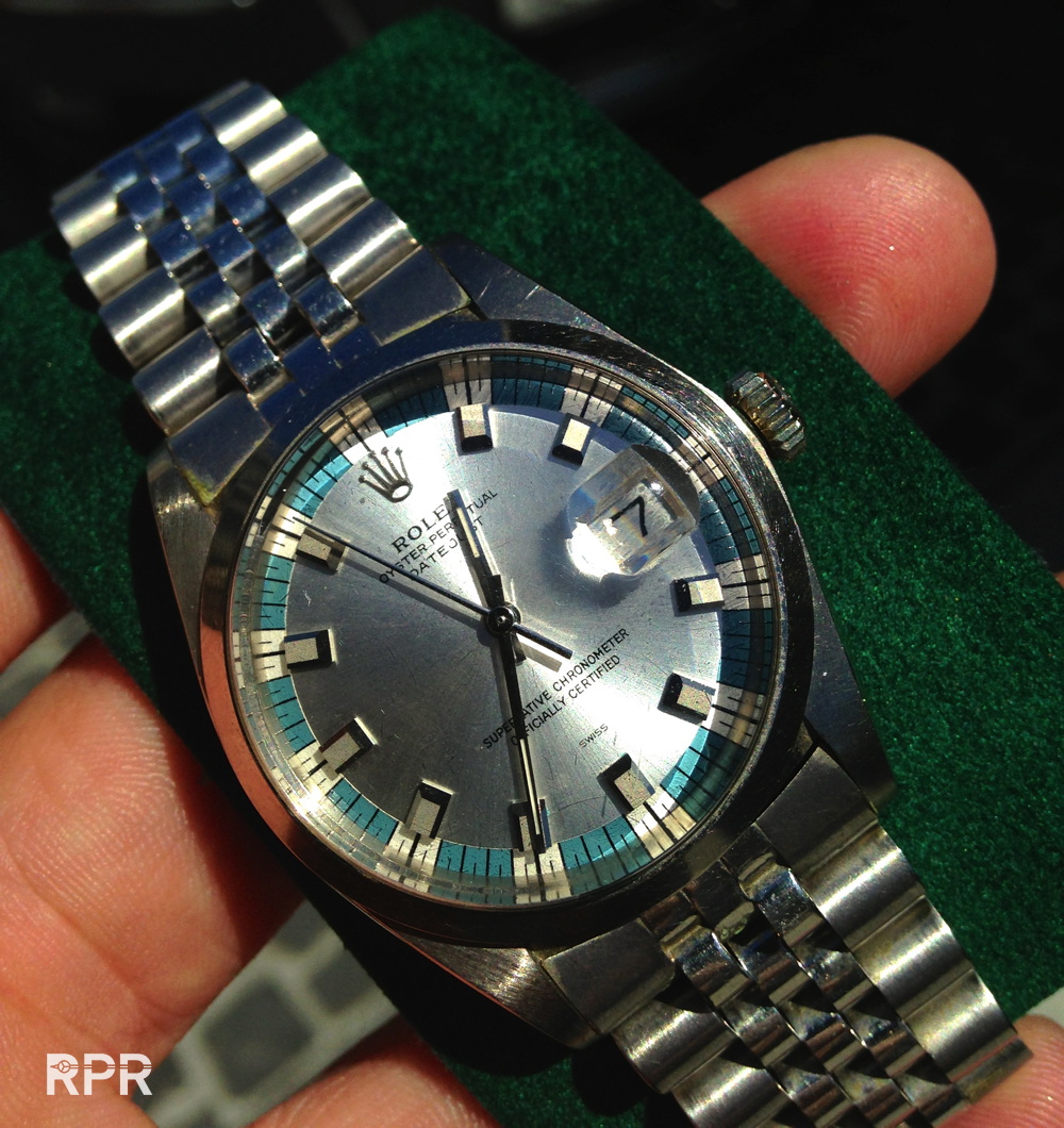
Many vintage Rolex watches have become legendary and next to James Bond Submariner it is certainly the Paul Newman version on a Rolex Daytona that has become hugely populair nowadays. Over the years lots of controversie has been around the Paul Newman dials. Even lawsuits from popular guys like musician John Mayer trying to sue a watch dealer and vise versa over counterfeit dials made international news. After the scam the Rolex market became much more educated and all little important details have been shared between collectors online so everybody finally knows that a ‘non step’ Paul Newman dial is fake. Originally the official dial maker Singer made a the minute track on the outside of the dial that was lower then the mid part, called a step. Many of these so called ‘Texas’ dials or later called ‘Mayer’ dials where sold and still once a while I receive an email if I can verify if such a dial is original or not. Nowadays Oyster Paul Newmans are hugely sought after and a must have in any great watch collection. The timeless cool look is just incredible and has been an example for many other watch brands.
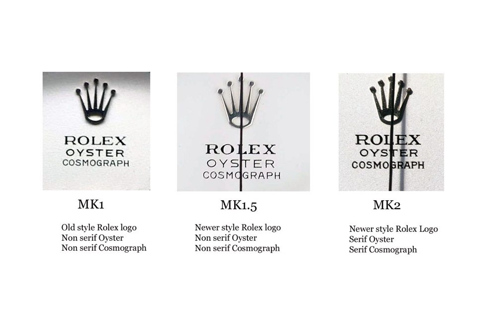
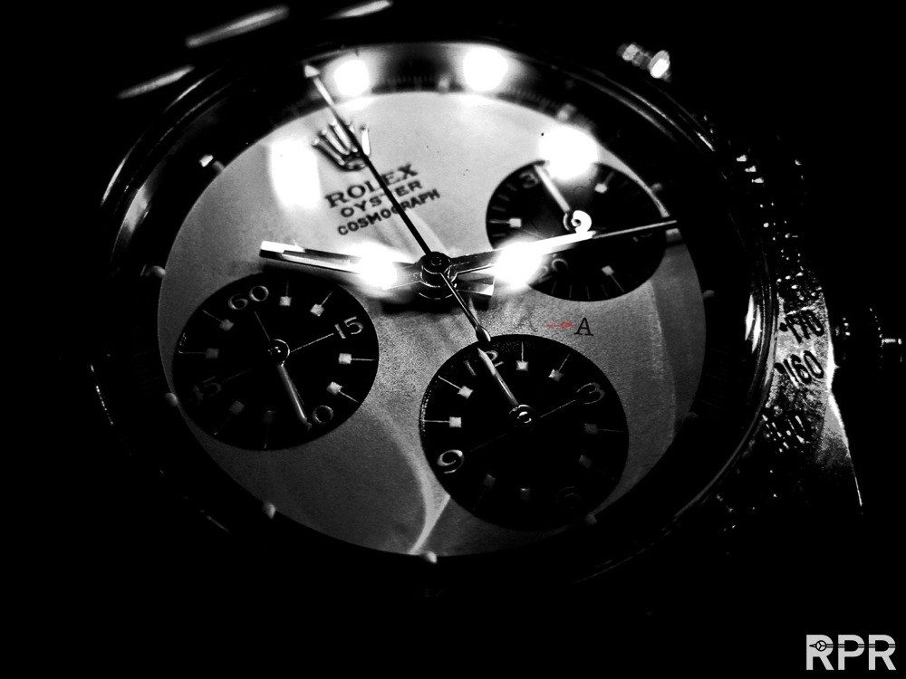
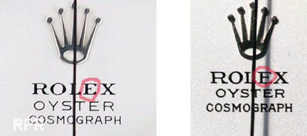
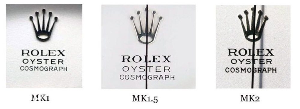
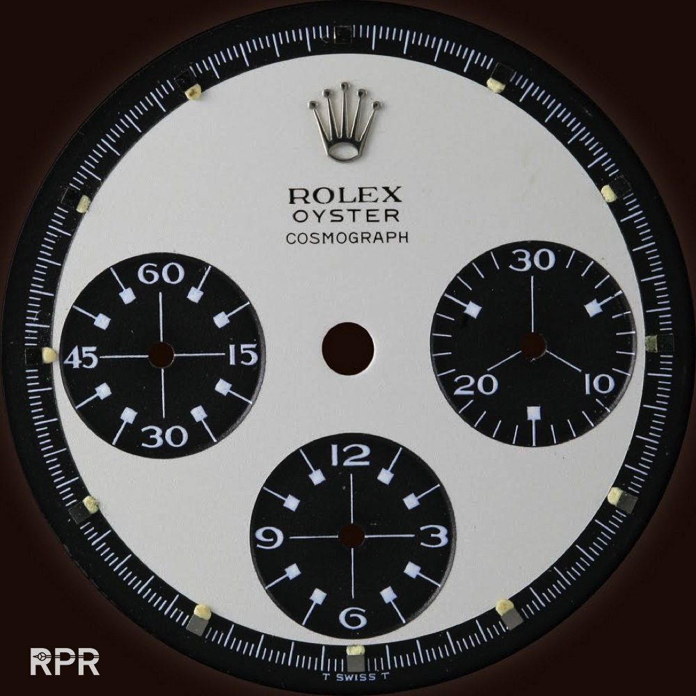
After this introduction I like to come to the subject I want to discuss today, the so called “Ghost” Oyster Paul Newman. I’ve already written an article about the phenomenon called “hidden daytona”. Go check it out on RPR. The Oyster Paul Newman dial versions are nowadays described in 3 different versions, the MK1, 1.5 and MK2. The difference between them is the old Rolex logo versus newer type and serif and non serif writing of the word Oyster and Cosmograph. At MK1.5 we see the non serif writing changed in a newer style Rolex writing with serifs but still with non serif old mk1 Oyster & Perpetual writing and finally the last version and imho the best looking one is the MK2 with serif Rolex, Oyster and Cosmograph writing, all in harmony…
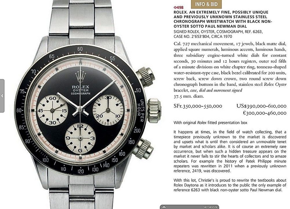
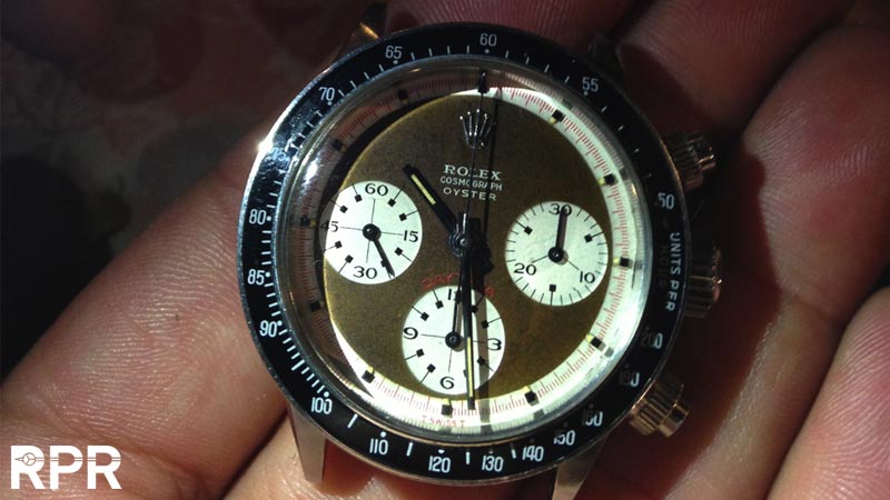
With the last version, the MK1.5 & the MK2, we often see that when you inspect the dial up close and I mean really up close you see some odd details. In 2014 Christie’s offered a so far unknown Rolex Oyster Paul Newman with black base dial, red daytona and red minute track. Why was it unknown, because it didn’t had the writing as RCO ( Rolex Cosmograph Oyster ) but as ROC ( Rolex Oyster Cosmograph). This was something very unusual as so far a black 3 color Oyster dial which had ROC writing was a fake, a Mayer dial or so called Texas dial because the watch dealer who ‘made’ these, came from Texas. But this one was different, all the Rolex graphics where spot on as you can see below….
The 2.6 million serial number ref 6263 with ROC writing which got offered at Christies and finally sold for $ 480K….
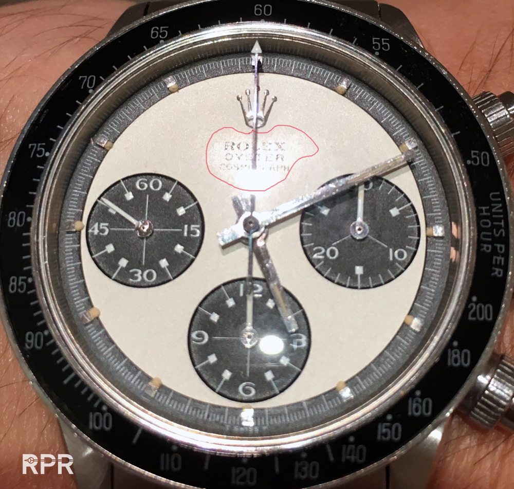
And after seeing the following picture we come to the point what I wanted to show you guys. On the black dial is clearly visible the “stain” around the ROC writing. Some call it “halo”making it look like a “ghost” writing and it has been discussed and questioned in depth. Read it on all VRF…..
I myself found it at the beginning before I handled it in my own hands also very questionable because besides that stain, the dial looks to be relumed, the markers are not perfectly positioned and the all over patina was not matching. I wrote back then:
“To me, seeing from the pictures the all over patina is not matching, the Rolex print is too bright compared to the rest, besides that, it doesn’t help there’s a stain exactly where the print is, which is a bit later by graphics and the surface is not so porous as we used to see. Summarized, that’s a lot of uncertainty to say the least. A devils advocate would logically say that the surface is not so porous anymore because it has been ‘threatened’ on top and lost it’s grenee effect and got professionally reprinted. You say it’s a old 6262 dial where Singer or Rolex had removed all logo and then reprinted it like it is now. I say that’s not logic as the rest of the dial is not sharp anymore, so rest us to believe it was a used dial that was mounted in a pump daytona, sold as a 6262, got back to Rolex, they removed the print, reprinted it as a Oyster ( why not RCO as some 20+ others that are around so far), then re-cased it and put it in a Oyster case and gave it back to..? Hmm that’s why I wrote ‘scary’ as the logo is spot on so far as I can judge from the pictures but the whole ‘action’ doesn’t logically make sense, that’s all i’m saying “
When you focus on the ROC logo you see it’s almost 3 dimensional, fat printed laying on top of the dial and after seeing it in geneva at the preview of Christie’s I was also convinced this dial is original Rolex / Singer…
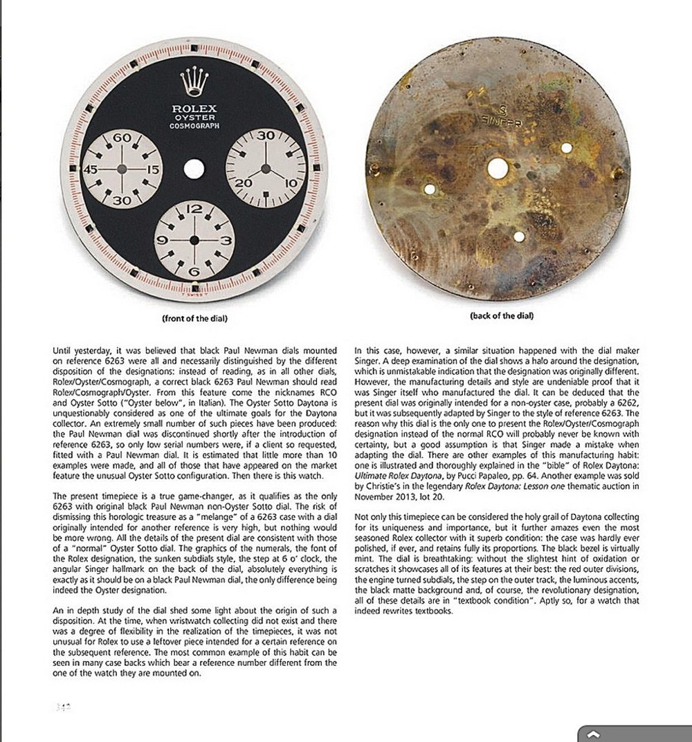
Although I had already written my article about the “hidden Daytona” we see with some MK2 Oyster Paul Newmans which you can reread over here my focus back then was much more on the fact that the “Daytona” writing was removed from an already existing 6262/6264 transitional non oyster Paul Newman then on the fact what happened at the top, with the ROC print.
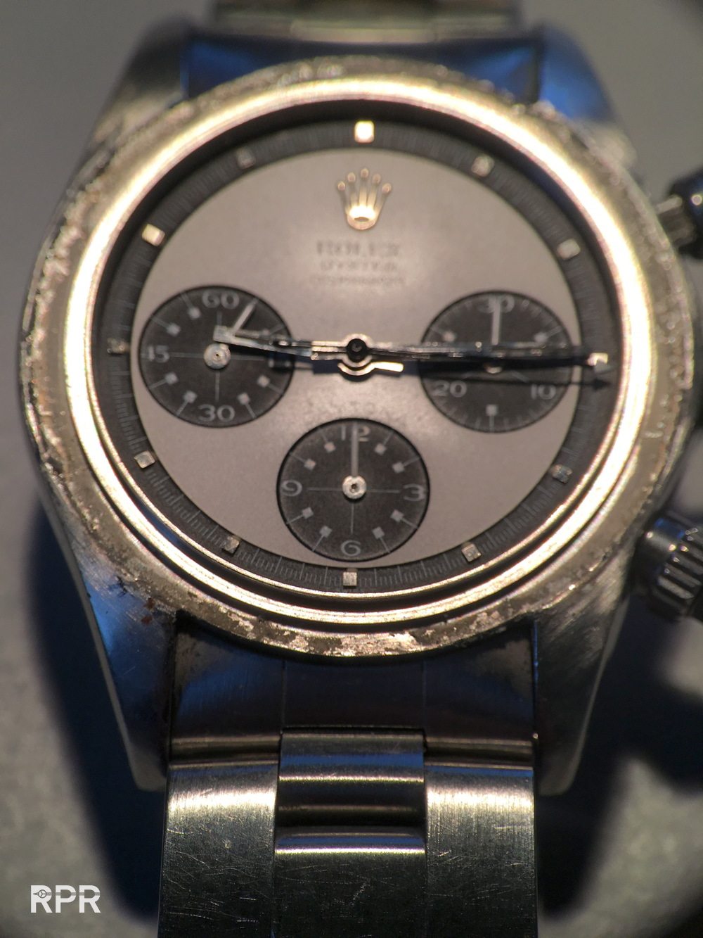
You see in above pictures that the “daytona” writing was removed. At below you clearly see the A at the end on the dial.
This examples, a MK2 with 2.92 million serial is also having the erased daytona writing around the 6 o’clock sub dial.
Normally you don’t see the halo or stain with this ghost Oyster Newman, specially not on the white surface. Instead you see an all creamy dial with fat lume, fat writings and perfect tone when you look at it up close…
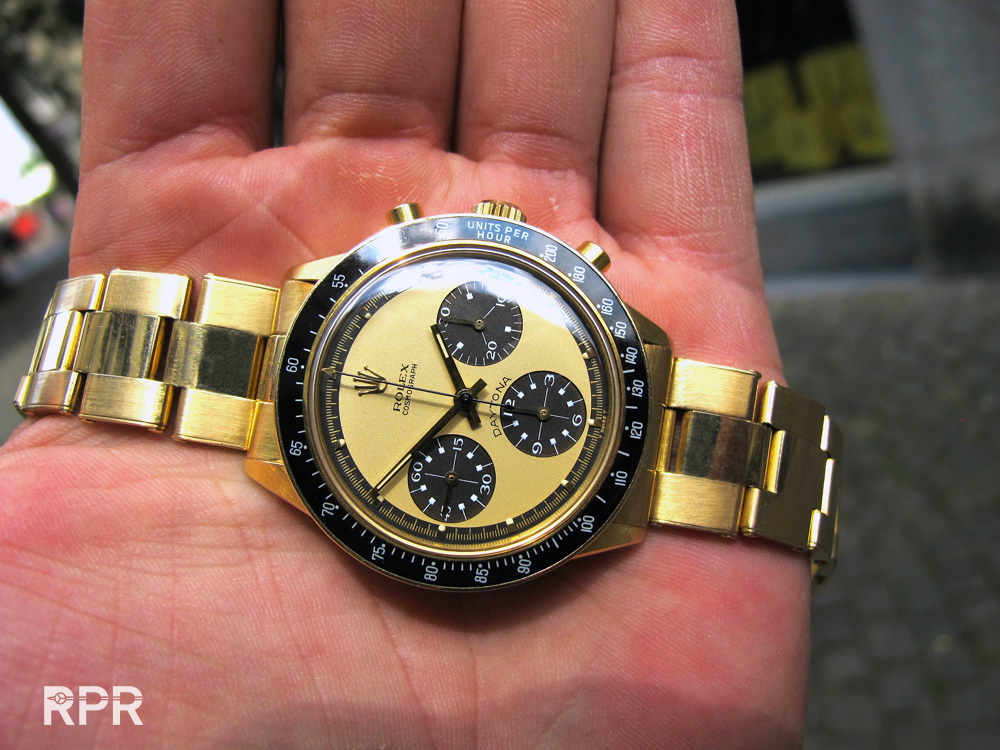
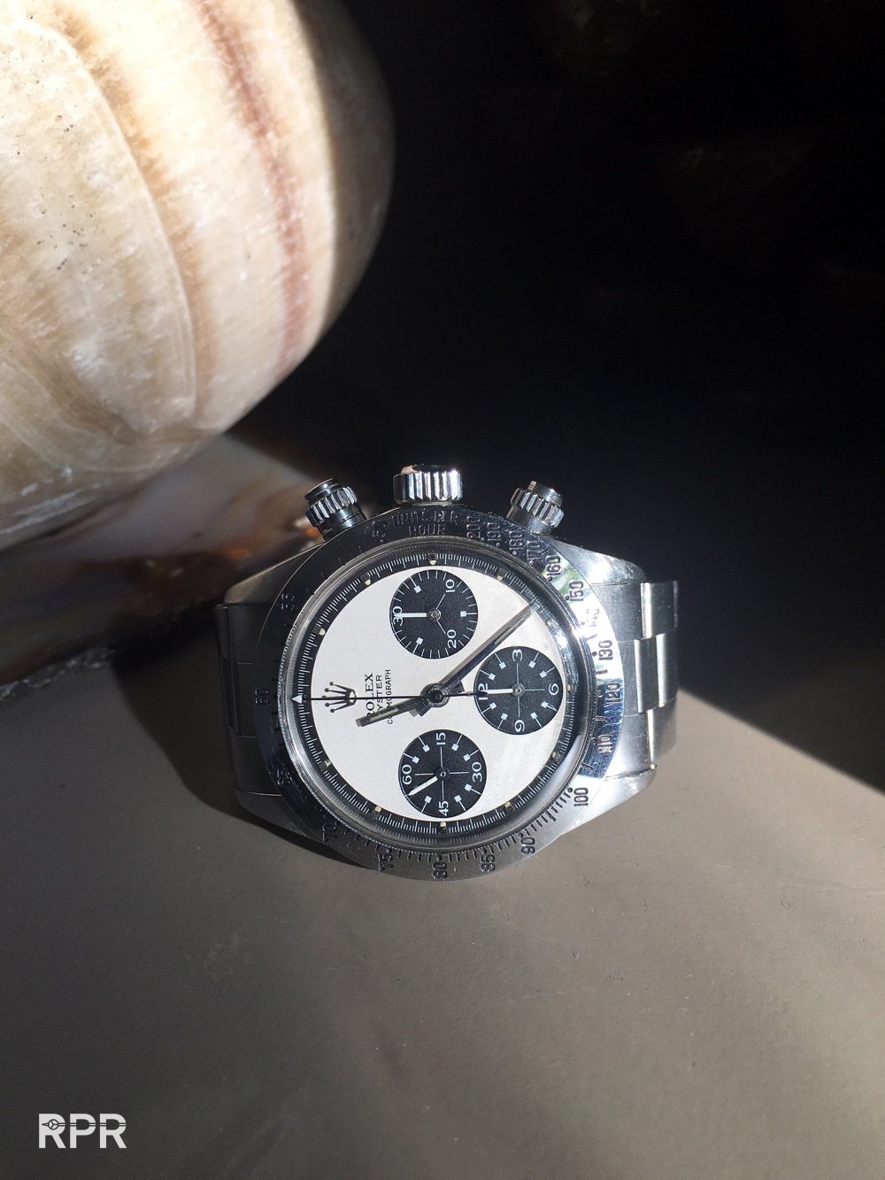
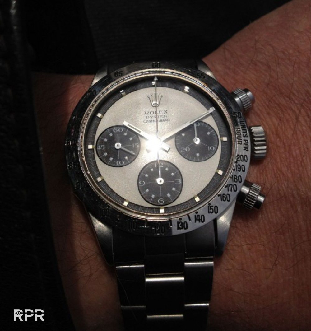
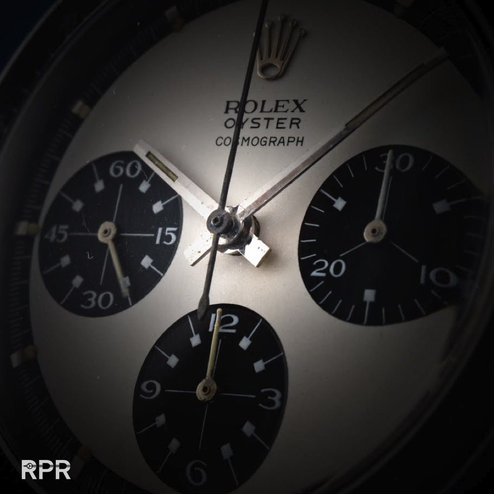
Now last week I got yet another Oyster Paul Newman from first owner. This time I had to travel to Austria to pick it up. The owner got it from the Rolex store in his town in 1974 and had it serviced twice (watchmaker marking show in the case back that this was done in Geneva in 1980 and 1982) when he had a spring replaced and top pusher. Never ever the dial changed nor did anybody else then Rolex had it in the service. The watch was still original as sold and i’m very happy with it…
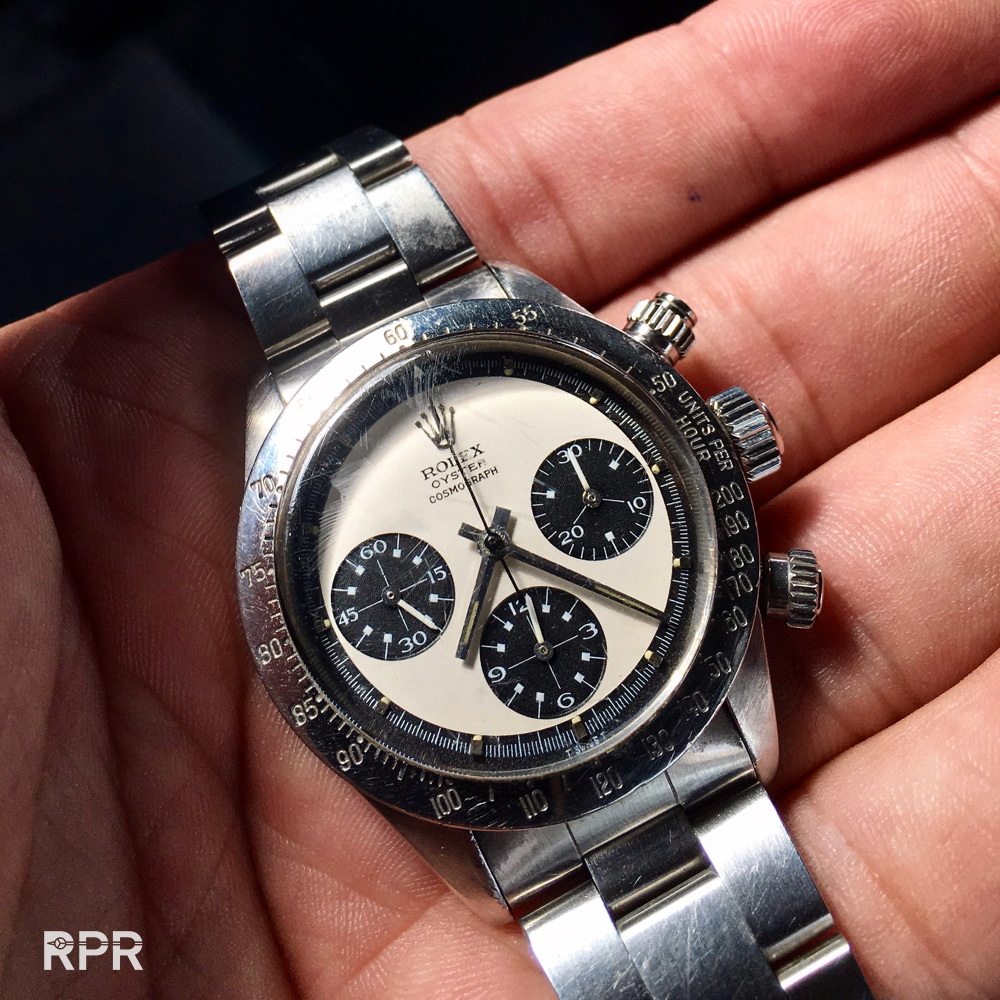
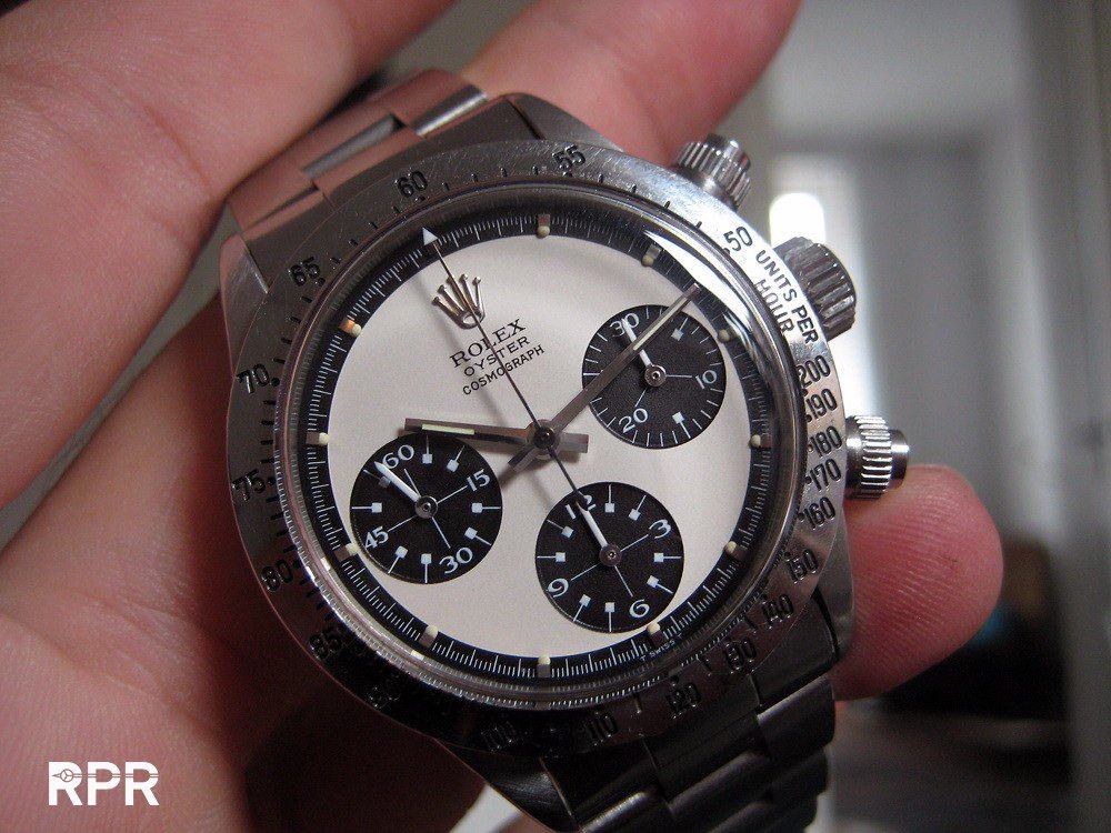
After I came home I double check the quality of the dial up close so I removed the crystal and the bezel….

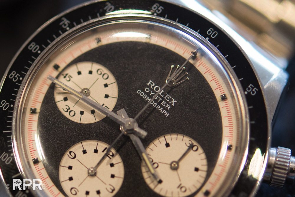
But then while moving it around under the spot I was examining it, I saw the ghost very clearly, see yourself. Around the top part of the ROC writing you crealy see the same “stain” or “halo” we saw on the black one from Christie’s….
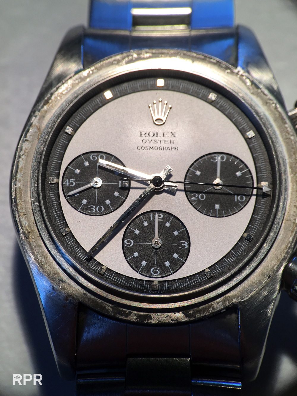
And also the lower part you see clearly the old “daytona” writing which was removed by Singer…
The old, left over Rolex Ref 6262 / 6264 Paul Newman dials where reused for the more populair Oyster screw down Paul Newmans in the last version, MK2 from a round 2.92 million batch and 3.048 batch, actually the last Oyster Paul Newman batch.
Beginning of the 70-ies rolex was having huge difficulties selling their Daytona’s. Besides that clients thought it was a bit to big, at their main market the U.S. the watch was related top the racetrack Daytona. The oil crisis in early 70-ies made Rolex wanna change the name Daytona from their dials. For Rolex and it’s dial maker Singer it would had been much easier to leave the red Daytona print on the dial. Last but not the least question is why did Rolex / Singer removed the total Rolex Cosmograph text you see below and not just added Oyster under the Rolex Cosmograph 6262/6264 dial?…
Because the typographies where using the ‘old style’ Rolex writing and had to change to the new style. For any designer this is VERY important that every graphic detail is modern and up to date, different then on previous examples and nowadays also so important for us collectors.
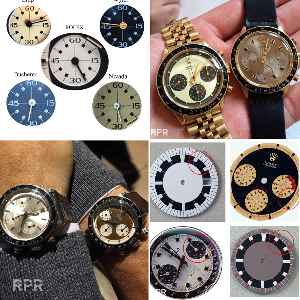
Now when we dive even a little deeper in the Rolex graphic we see above that the MK1.5 and MK2 are NOT using the same Rolex print. It looks kind of the same but actually it’s different when you compare it up close. I enlarge it for easy viewing…..
When you zoom in above and focus on the ” E ” of Rolex you see it’s totally different. On the final MK2 version the middle bar of the “E” is way longer then on the MK1.5….
From above line up first you immediately see that the MK1 print is clearly difference then the rest. Between the old thin Rolex print and the newer thick Rolex print is a huge difference. Next question after the fact that the MK2 are “HALO”is if the MK1.5 is also having this effect? With other words, did Singer take of the total print of an earlier donor Paul Newman dial to reprint a Oyster style MK1.5 logo on it?? Find below an picture I received of a french collector showing you that a MK1.5 is indeed also having a “HALO”….
Now to make it even more complicated, the MK1 with its old style Rolex logo and matching Cosmograph is NOT having any “Halo” or “Ghost” effect as you can see below from this example of italian collector Militos. The MK1 is the only Oyster Paul Newman that’s having a logo cliche print that never changed. Singer designed it and used it in the batch of Oyster PN with serial 2.085.xxx.
So to come to a final conclusion, only the Oyster Paul Newman MK1 dials are not having a erased Rolex logo. Find below a close up of a MK1 dial that is in a reference 6263 case that was sold by the Jeweler Ricciardi.
Rest me to say that there are no 100% rules in any theory as you see below. Singer added the “Oyster” print on the both RCO dials just under the “old” Rolex Cosmograph text. Nowadays we know these RCO’s are rare, much more rare then a white Oyster Paul Newman so these where an exception, maybe just made to test and see and then decided by Rolex not to continue with it because the word Daytona was still on the dial…
Both MK1 versions and both come from original owners, on top the black one and below the brown tropical one that sold for over 2 million recently at Phillips. My personal view on these RCO’s is that one needs to be 100% certain that a dial did not have the word “oyster” added afterwards to make me pay a huge premium. 
There are also RCO’s with newer Serif Rolex font, known as Mk2, here an exceptional examples of a great privat collector…
Known as non Oyster Paul Newman is this rare regular RCO Daytona. Befor you ask yourself what is so important about below Daytona, normally all regular Oyster dials have the printing Rolex Oyster Cosmograph, ROC and not RCO as seen below.
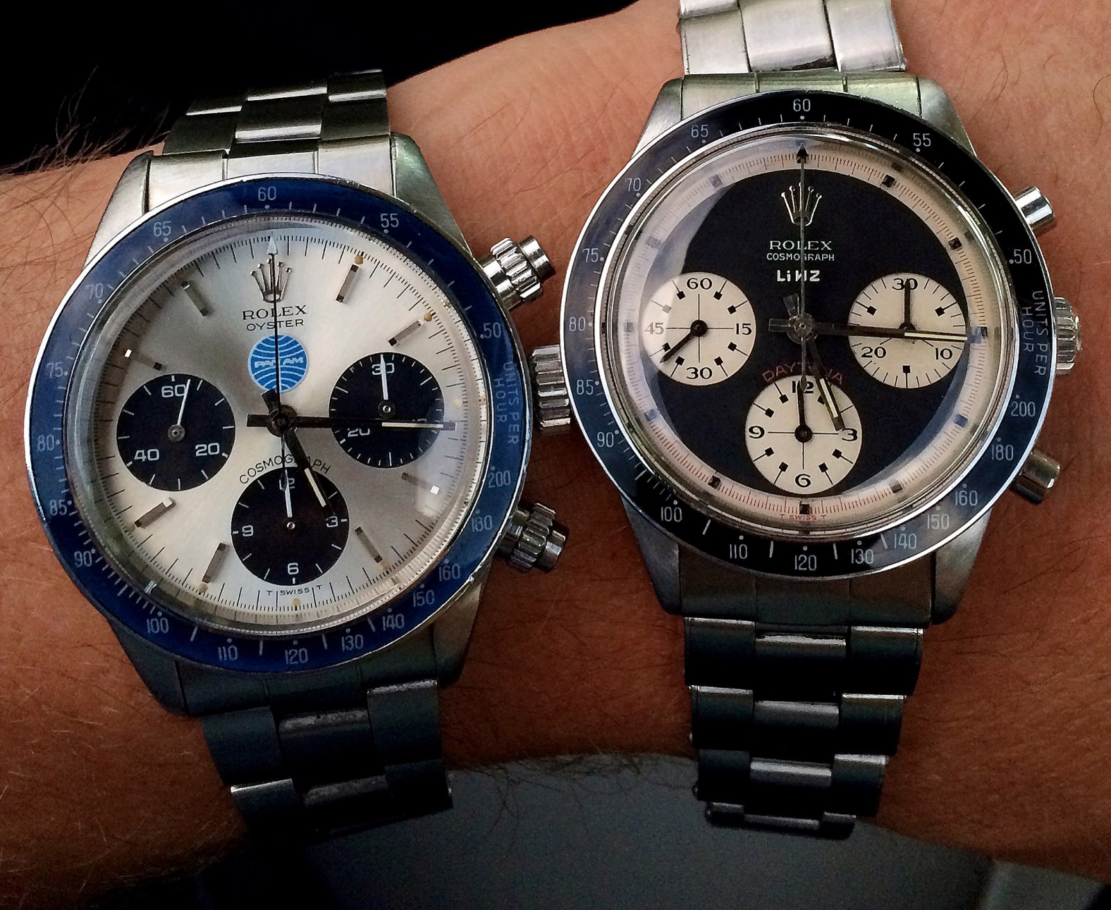
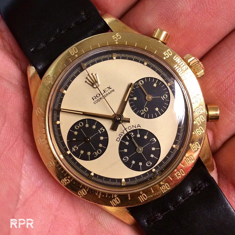
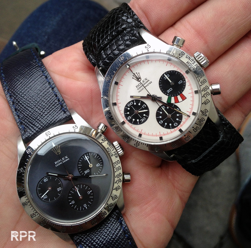
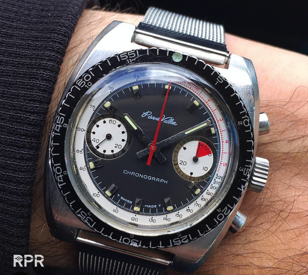
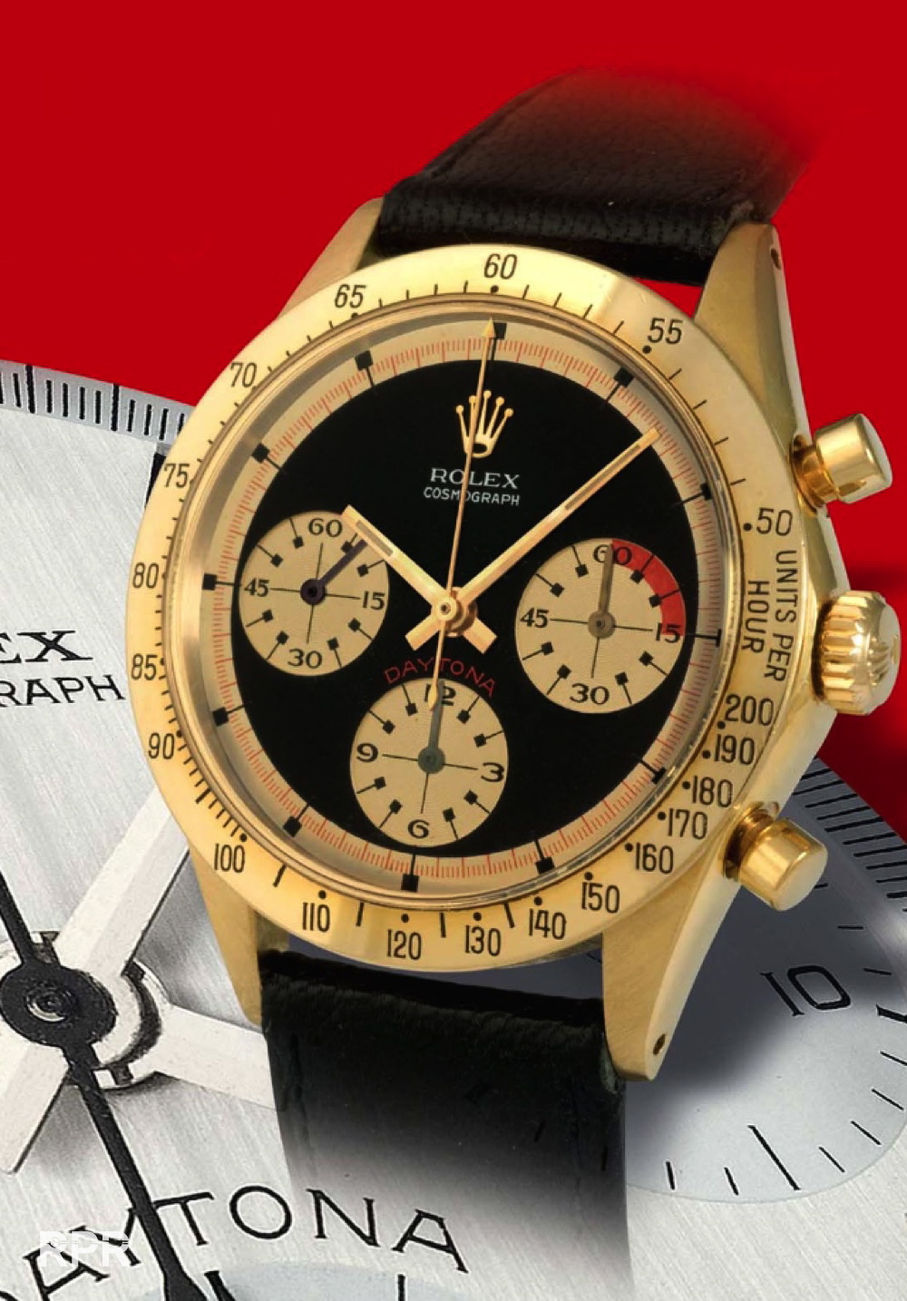
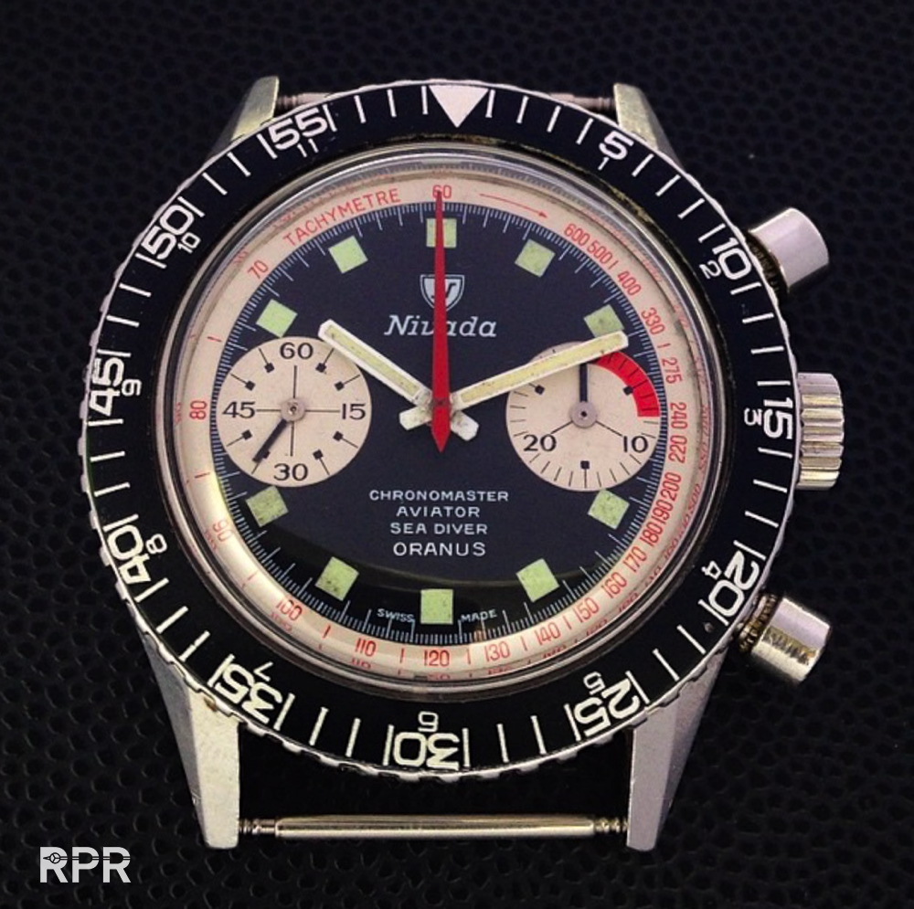
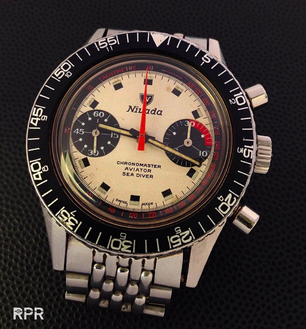
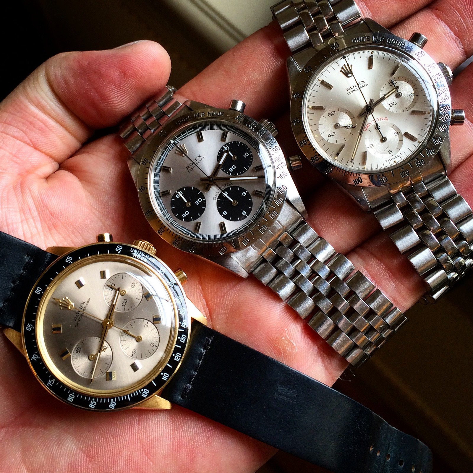
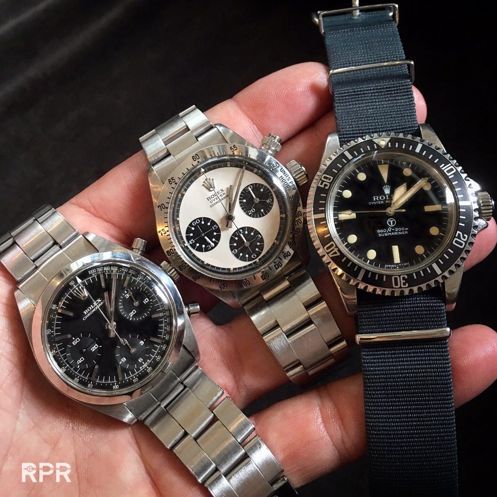
To end for today, here’s a perfect trio, the elegant, the exotic and the rough. For a true gentleman actually all he needs vintage Rolex wise ;)… Thanks for tuning in and I do hope you have enjoyed my report. If you have similar Daytona or you want to ask me a question, no problem use the “CONTACT” button on top of the page and send me an email. I’ll get back to you as soon as possible.
Back to my new MK2 Oyster Paul Newman with 3.048.xxx serial alias “The Ghost” Oyster Paul Newman Daytona.
Cheers,
Philipp